Strategic audit + brief
Desk research, visual audit of the existing brand, competitive benchmark, symbolic reading of the sector, strategic questionnaire for the leader.
A full rebrand handled independently, from strategic framing to the booth built on site at Paris Le Bourget. Ongoing relationship in 2026.
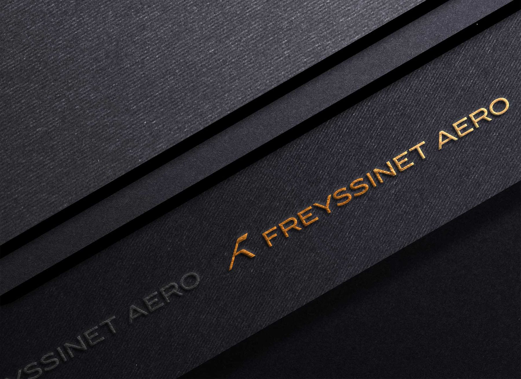
A milestone to clear on brand perception, with the tipping point set at the SIAE Le Bourget air show 2025. The challenge: to register in the defense-linked aerospace field.
At the start of the mandate: a logo the leadership considered dated, a website maintained by the IT person, no editorial line across the materials. A communications team still being structured.
A tight initial brief, logo, guidelines, a few website mockups. After the audit, I proposed three levels of depth. The leadership chose the most ambitious one, a founding overhaul anchored in a strategic method.
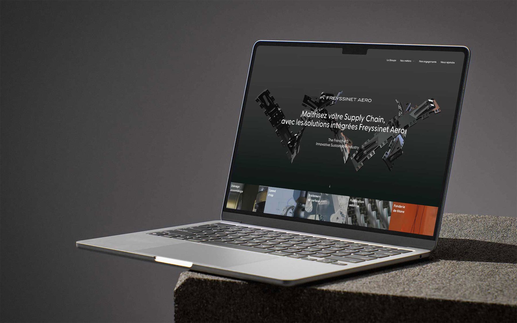
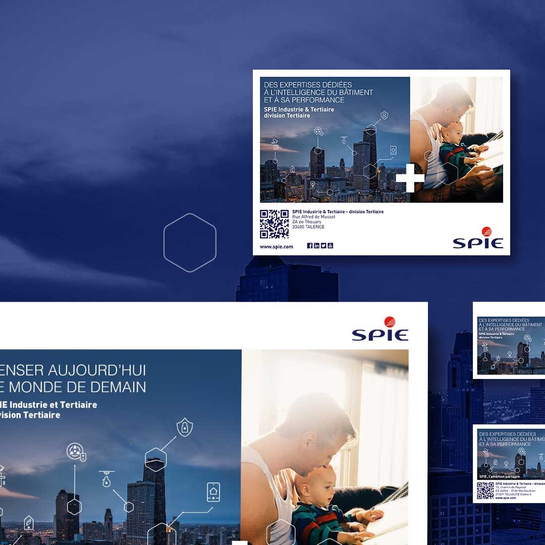
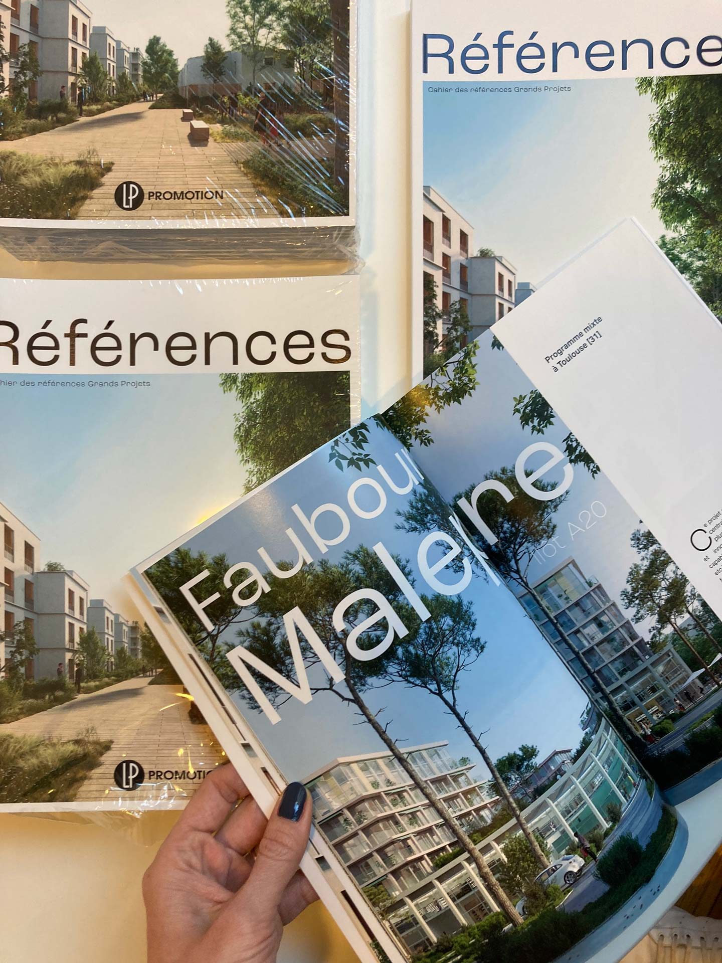
Brand audit, architecture, logo overhaul and the creation of a complete identity system. Production of the guidelines, rollout across all materials, full website overhaul, direction of the corporate photo shoot.
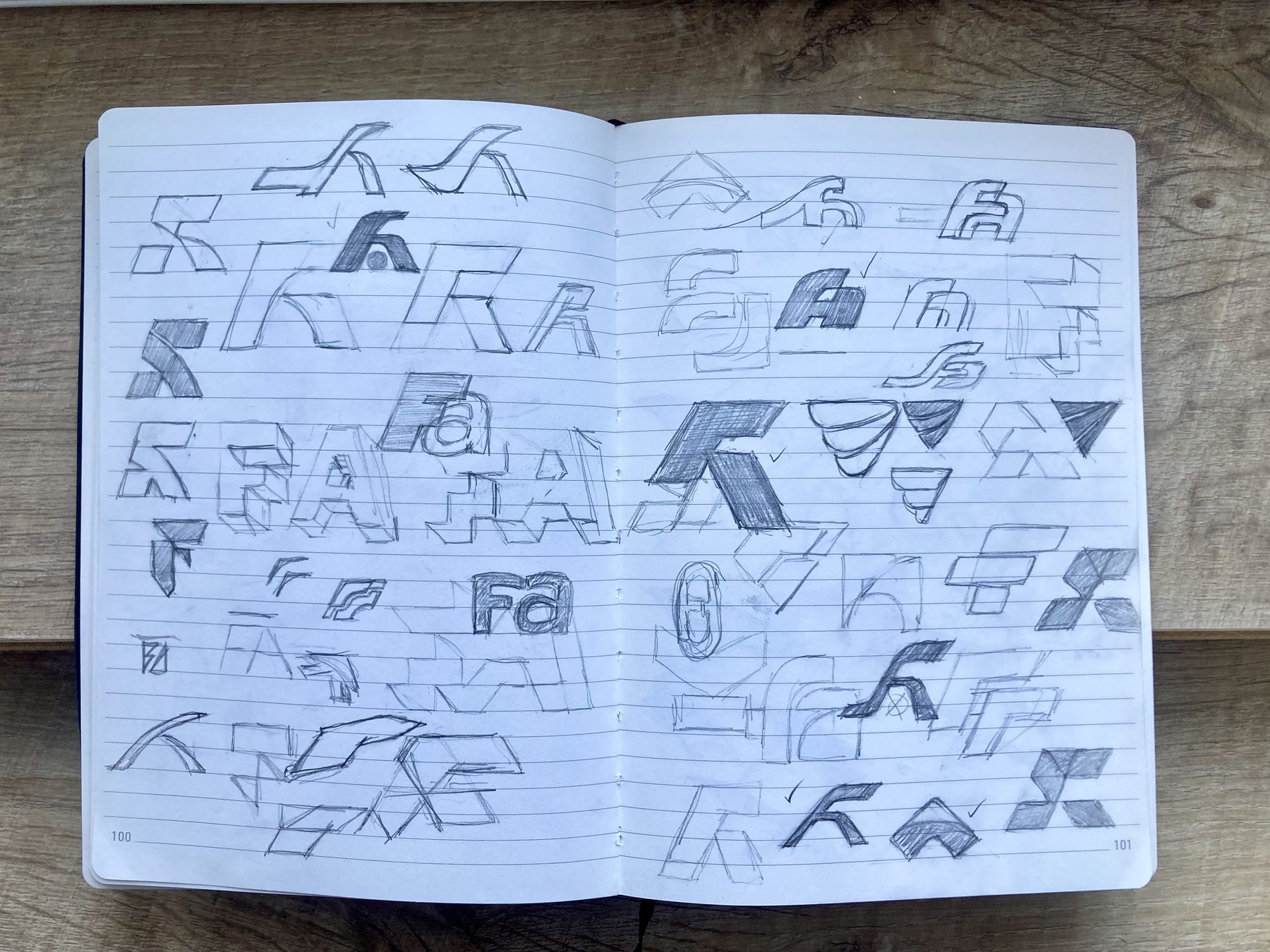
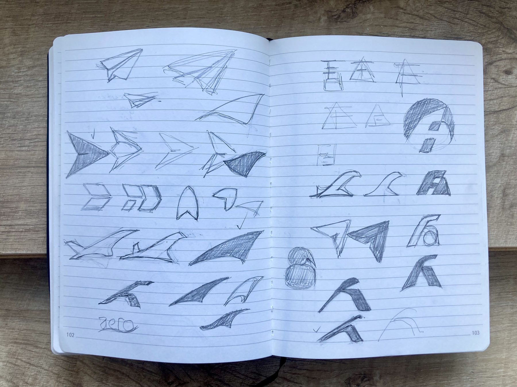
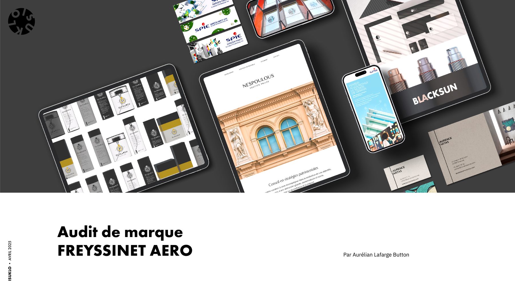
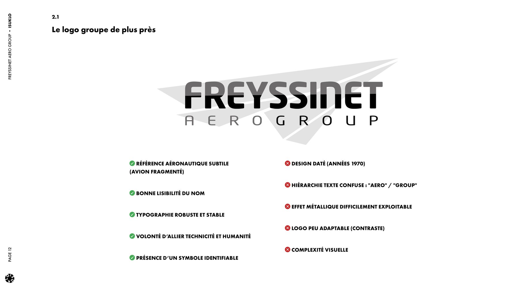
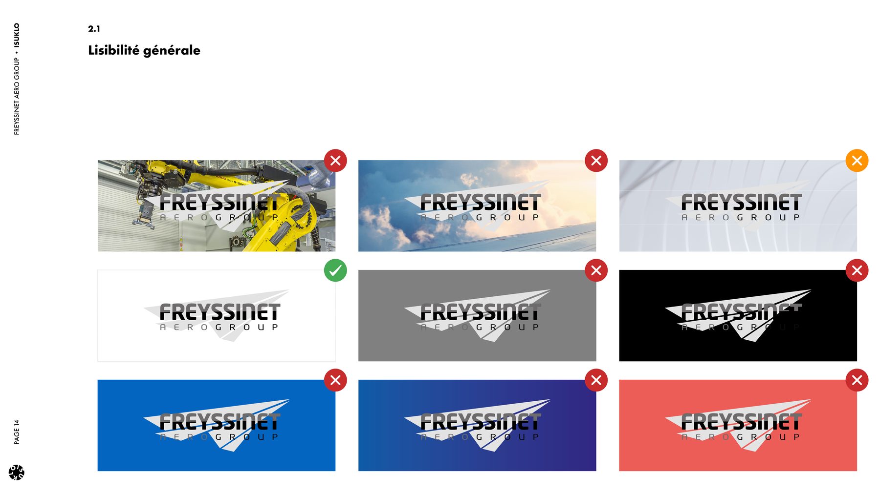
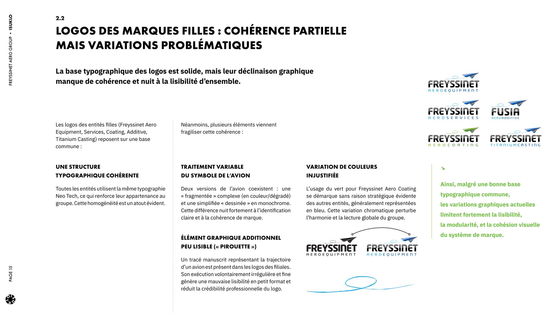
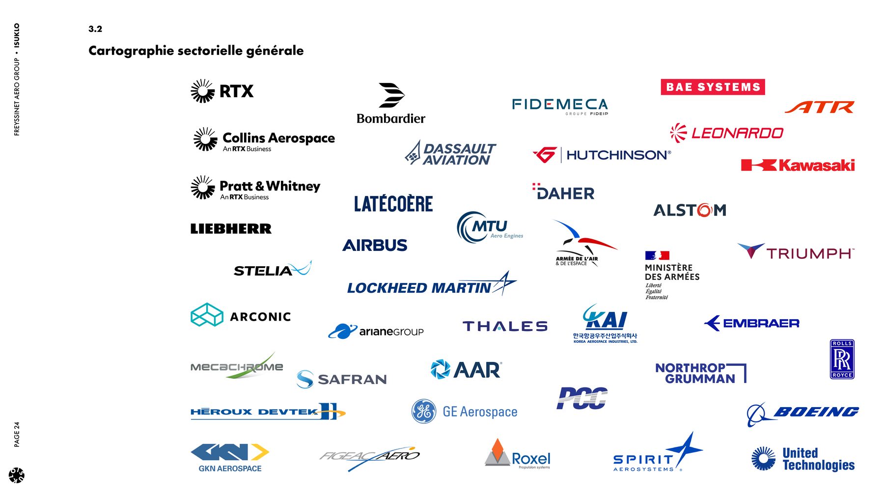
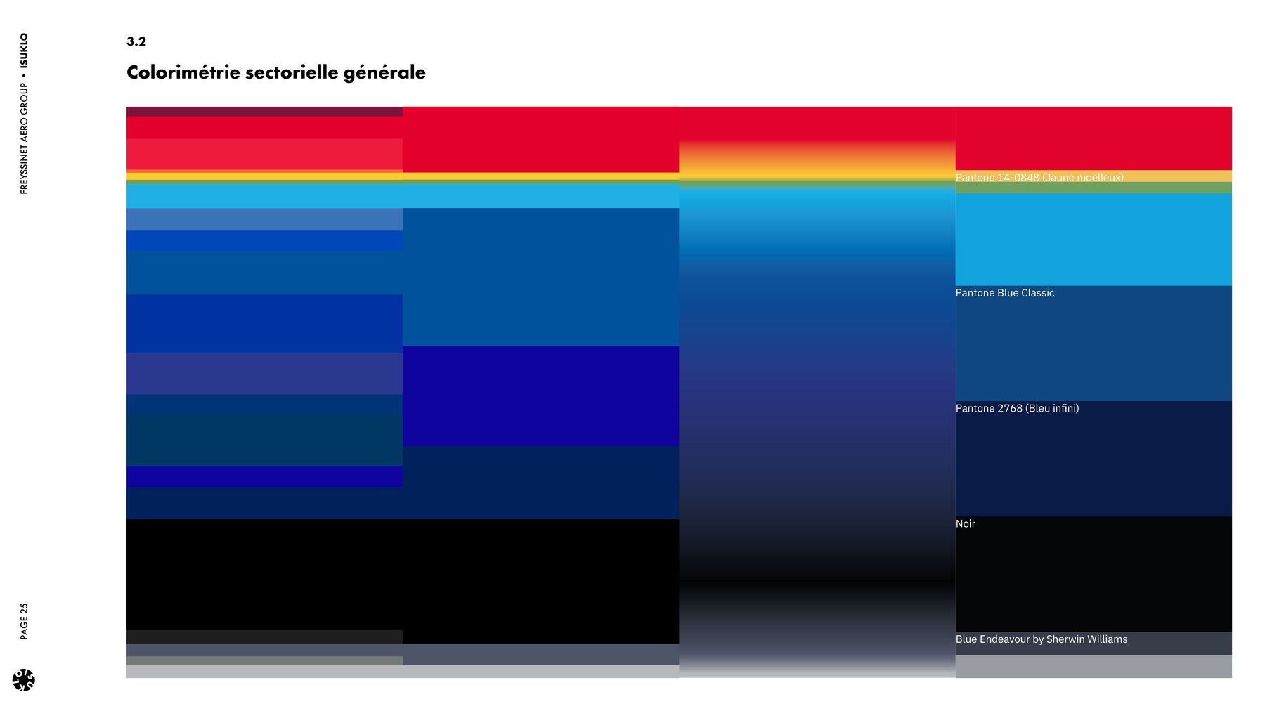
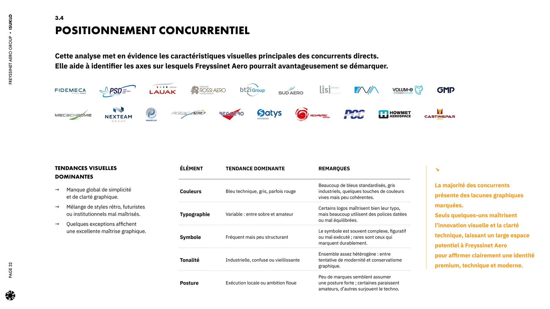
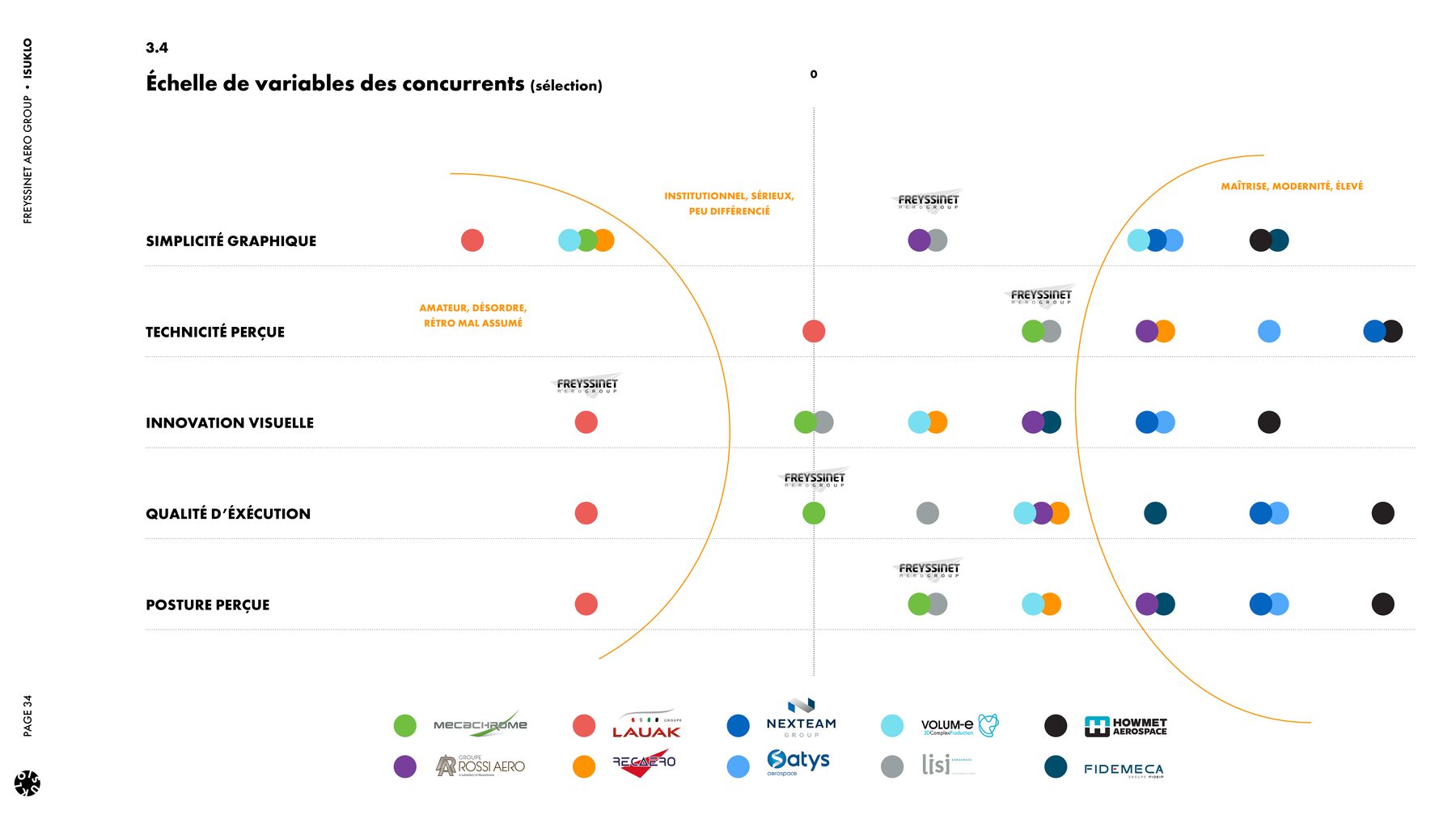
Excerpts from the brand audit, scroll horizontally on hover.
Seven sequenced phases, one deliverable per phase, leadership sign-off at every step. This method served both as the scope of work and as the contractual basis of the mandate.
Desk research, visual audit of the existing brand, competitive benchmark, symbolic reading of the sector, strategic questionnaire for the leader.
In-person workshop with the decision-makers, setting the attributes, the mission, the promise and the values.
Three complete creative directions (worlds, typography, palette, logo proposals), arbitrated by the leadership.
Optimisation of the selected logo, colour and monochrome variants for the parent brand and the sub-brands.
Typography, palette, iconography, shapes, demonstrated on print and digital mockups to validate consistency.
A concise document for quick adoption in-house and with external partners (printers, events).
Full reference document, logo usage rules, typography guide, layout, iconography, photography principles.
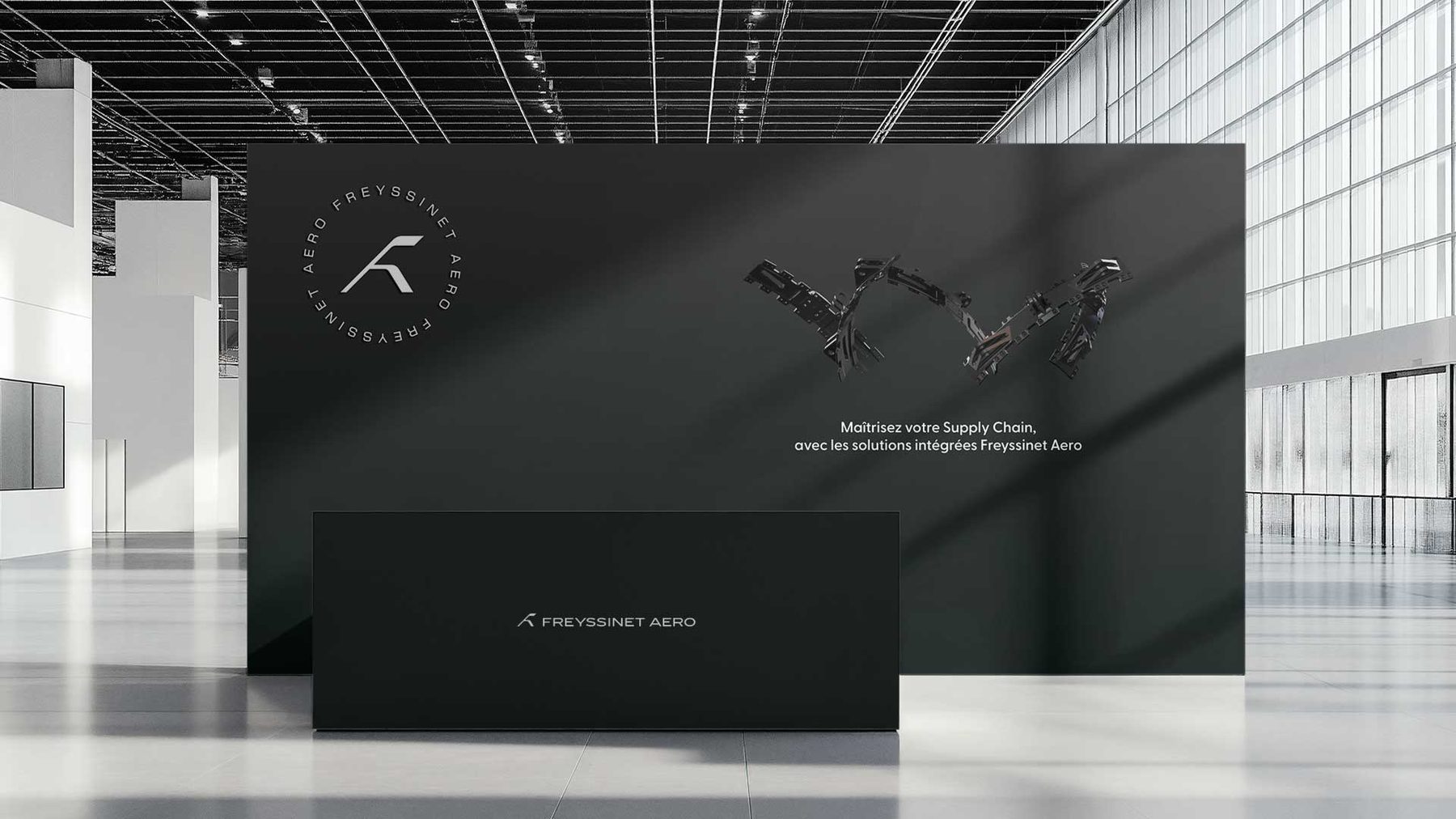
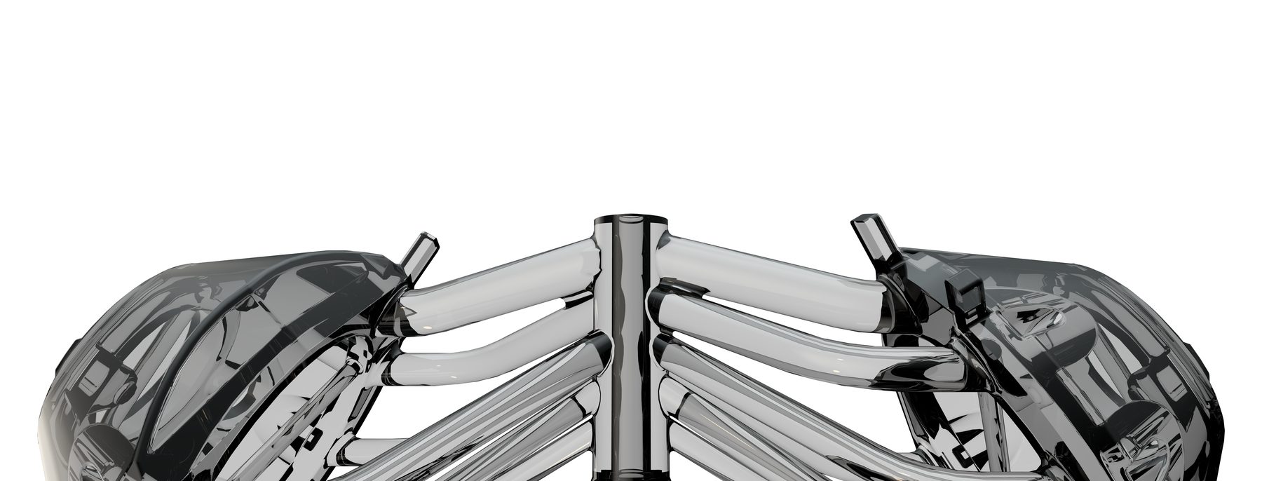
The method applied in the field. Trade-offs, workarounds, redos: what the Le Bourget timeline and the internal organisation imposed.
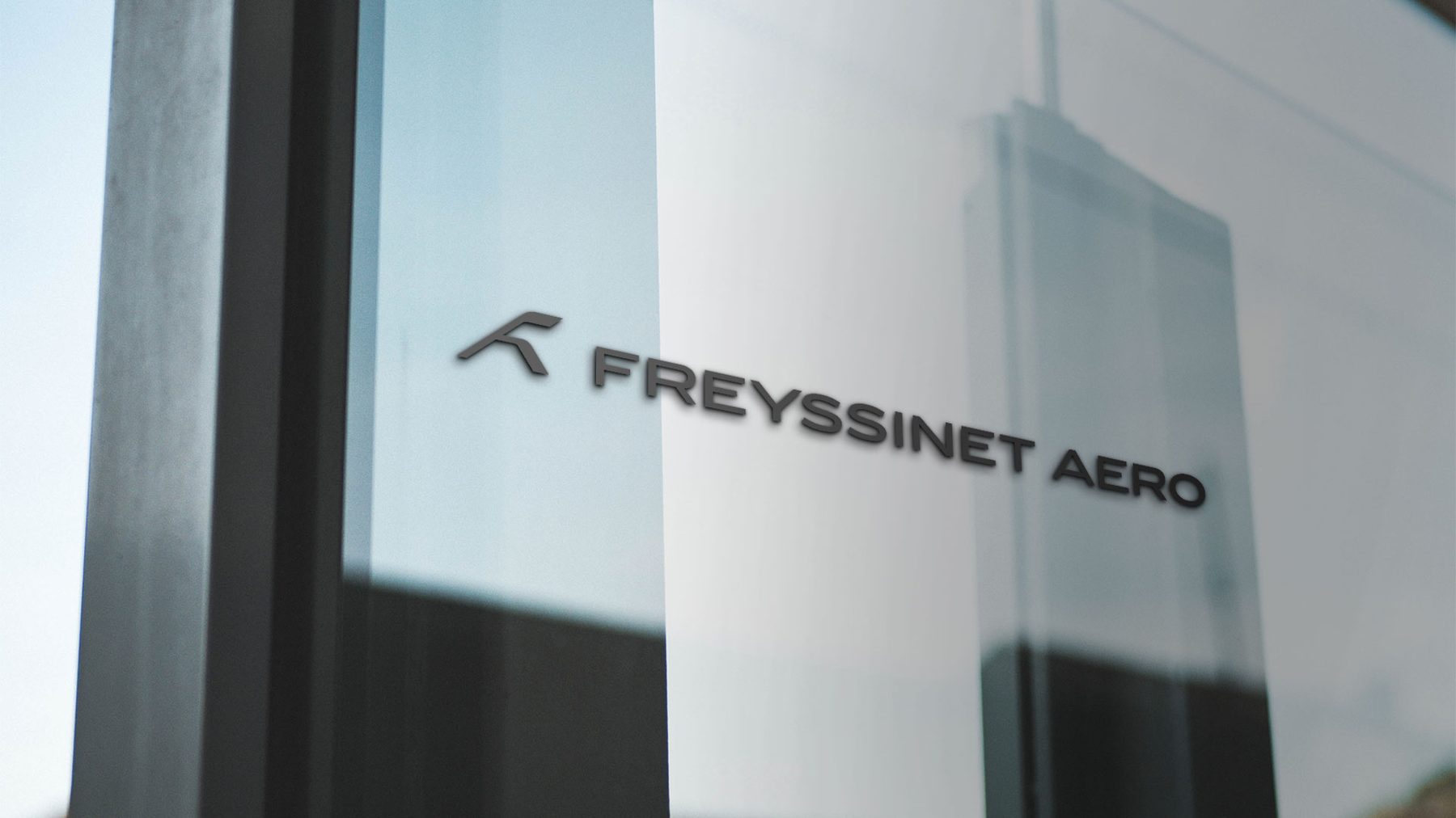
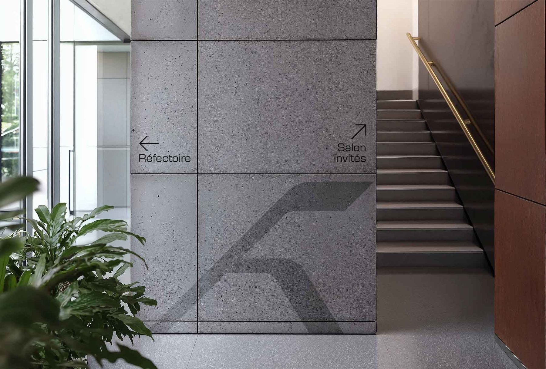
The alignment workshop framed the vision with the leadership before any execution. The identity was conceived as a system, not as an isolated logo. Rolled out from sign-off onward across signage, stationery, 3D and real environments.
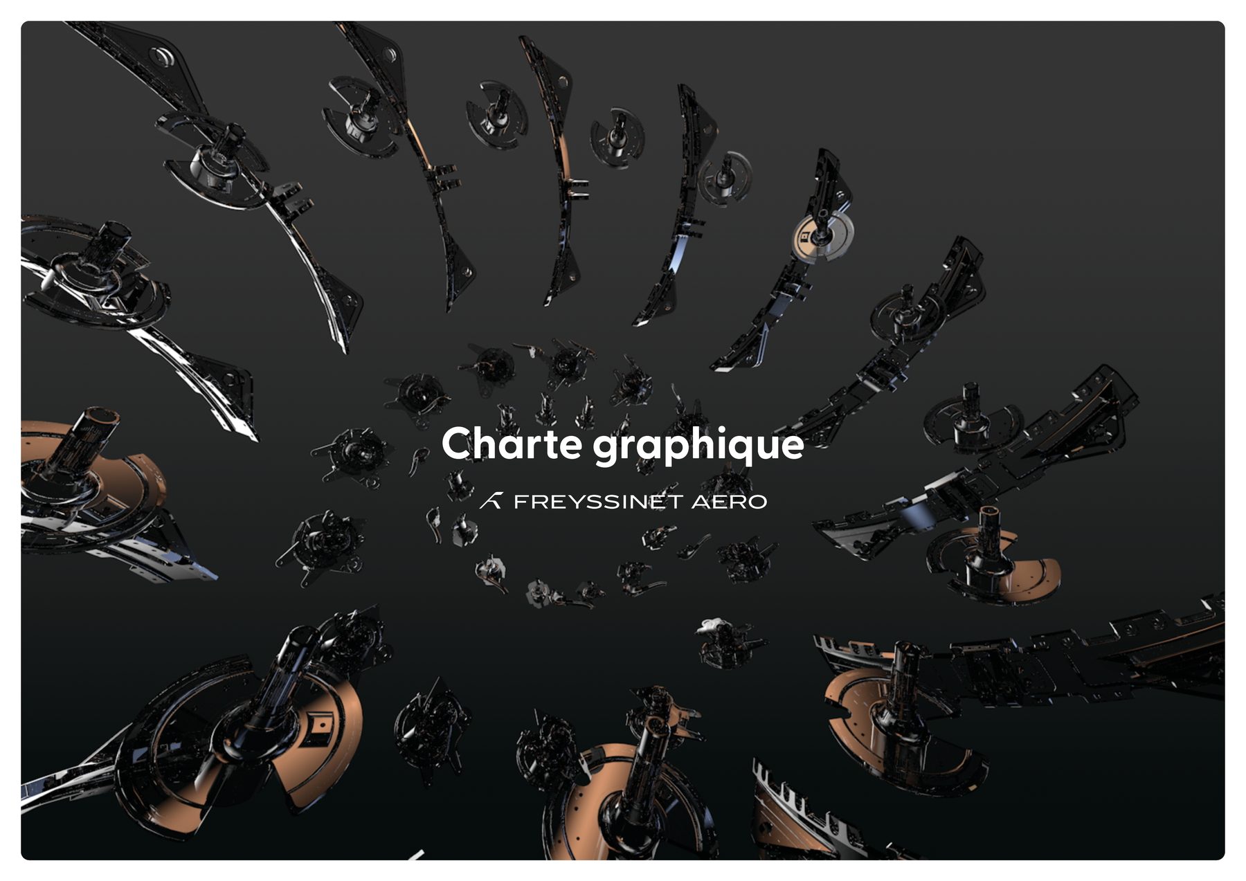
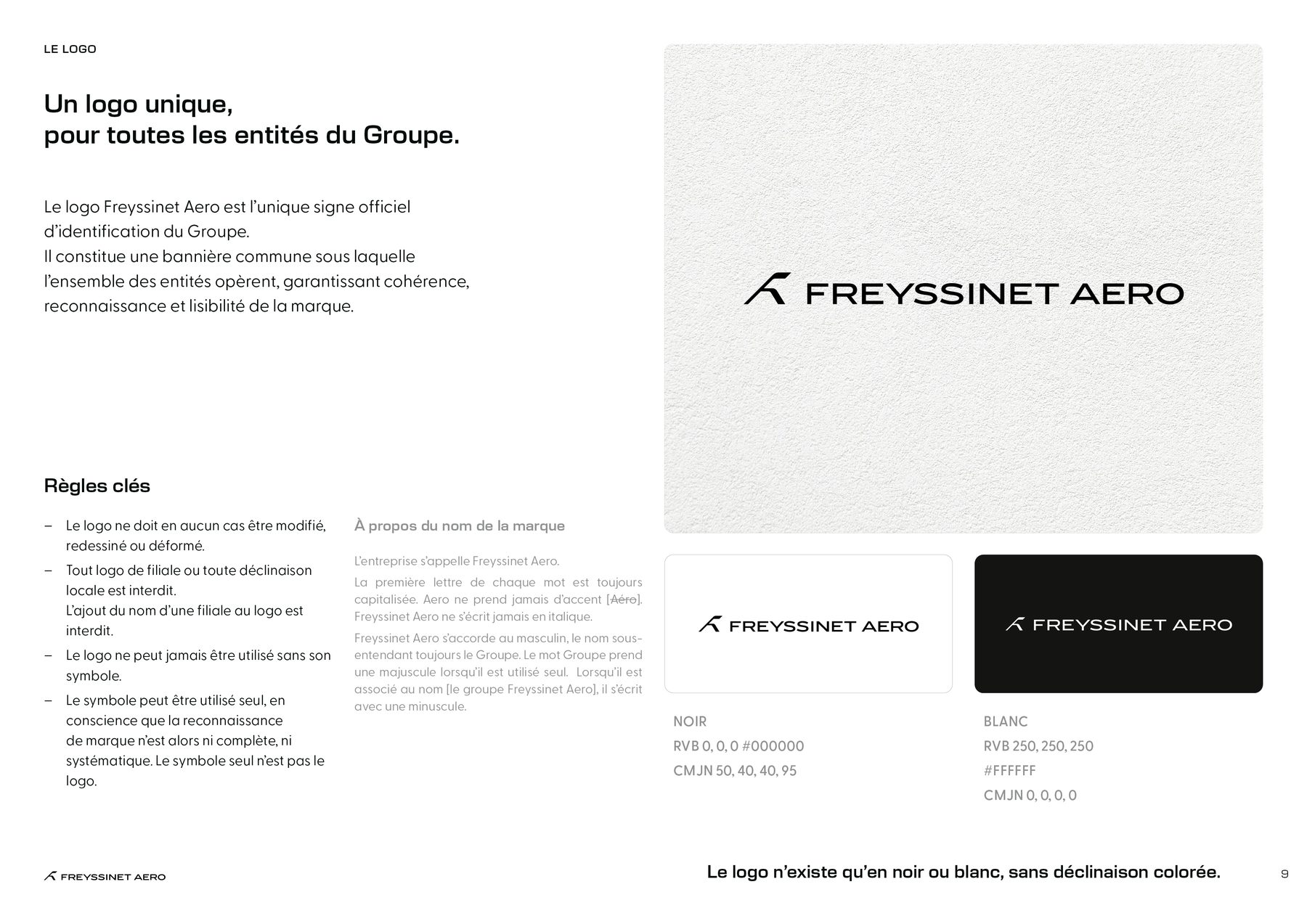
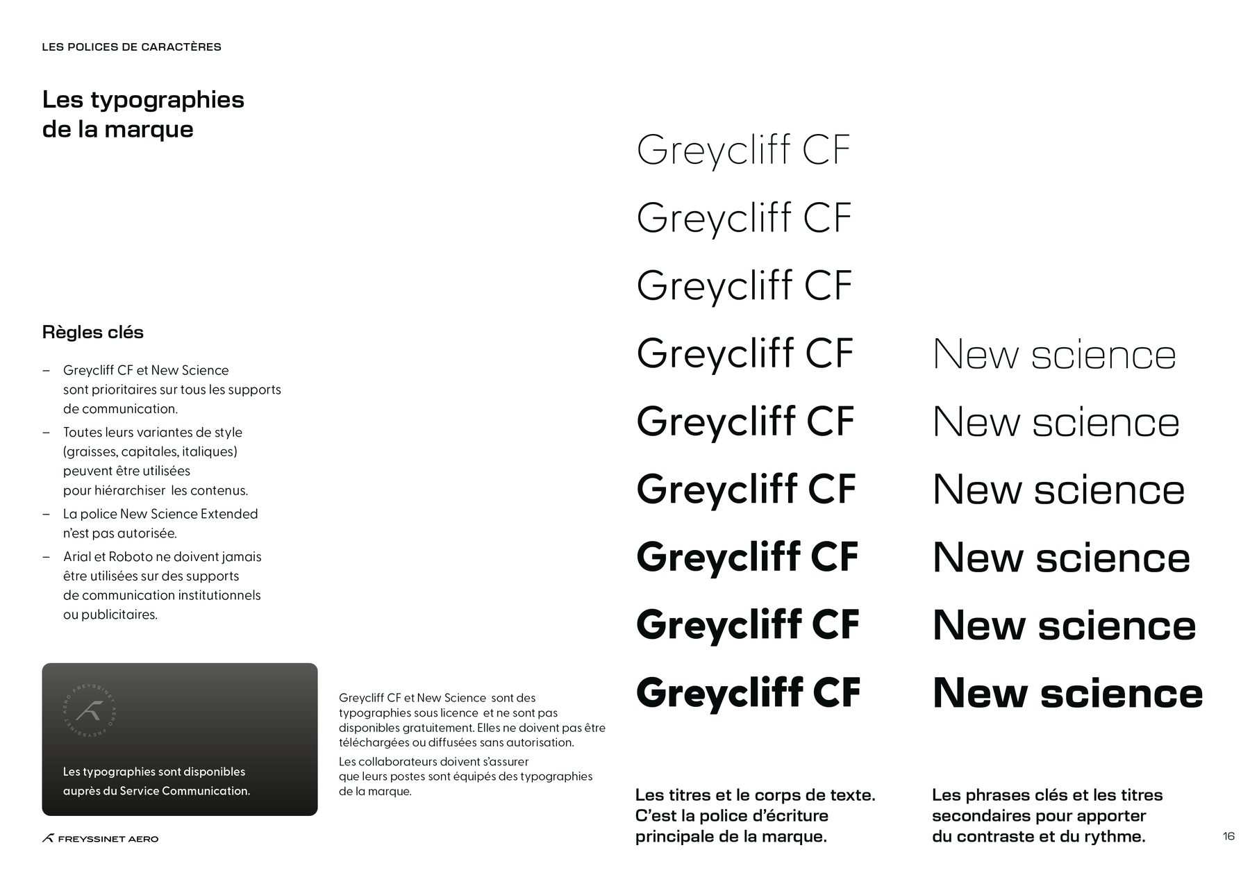
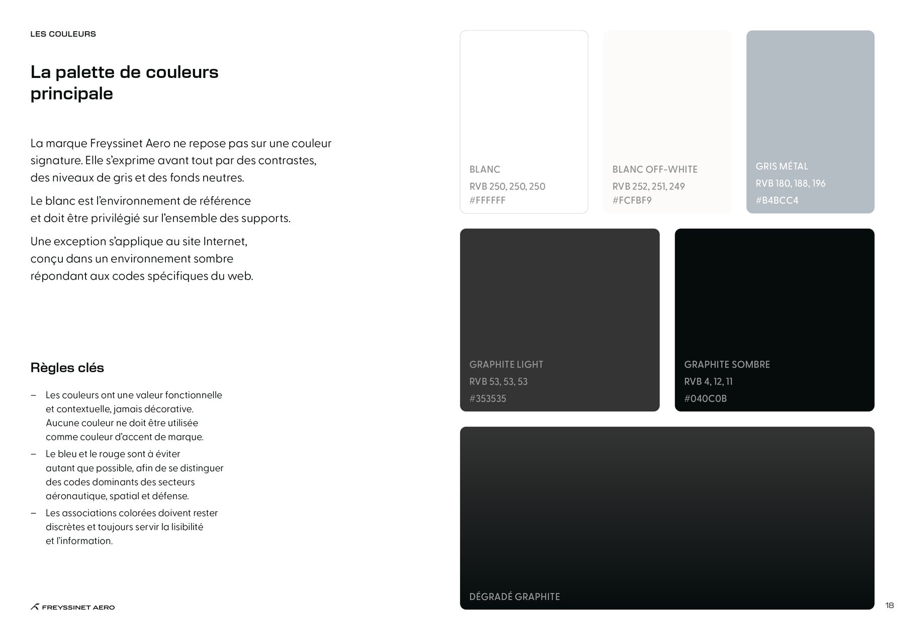
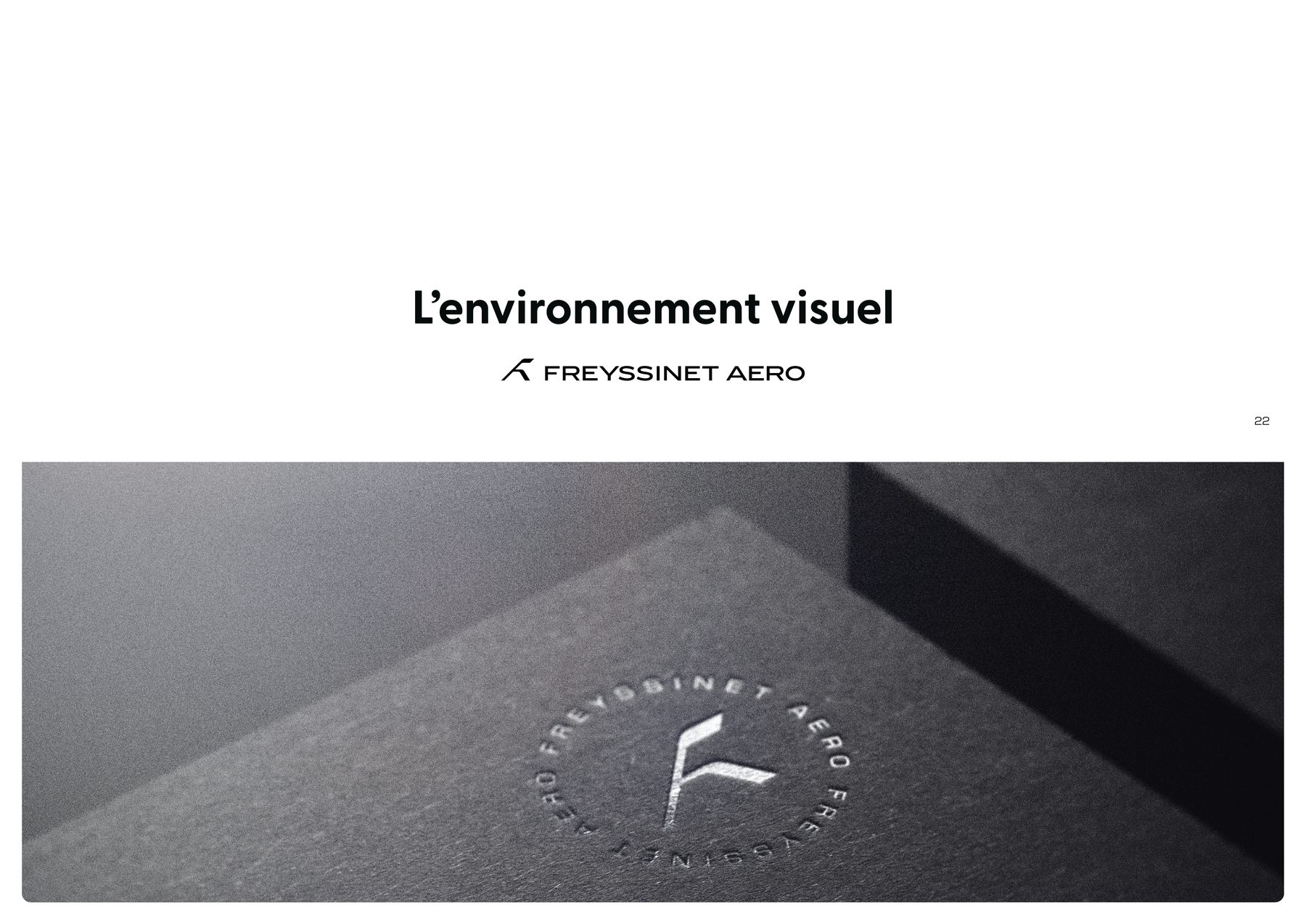
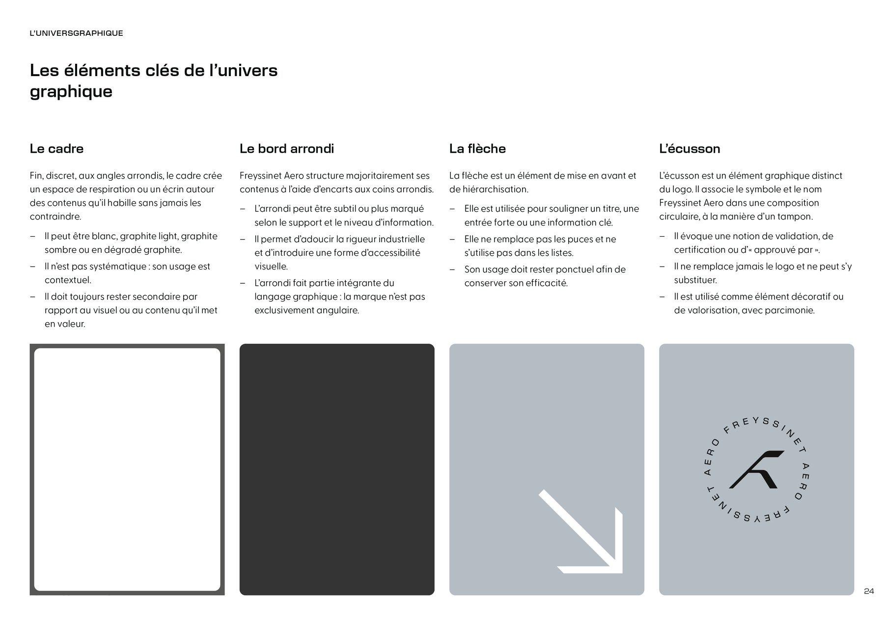
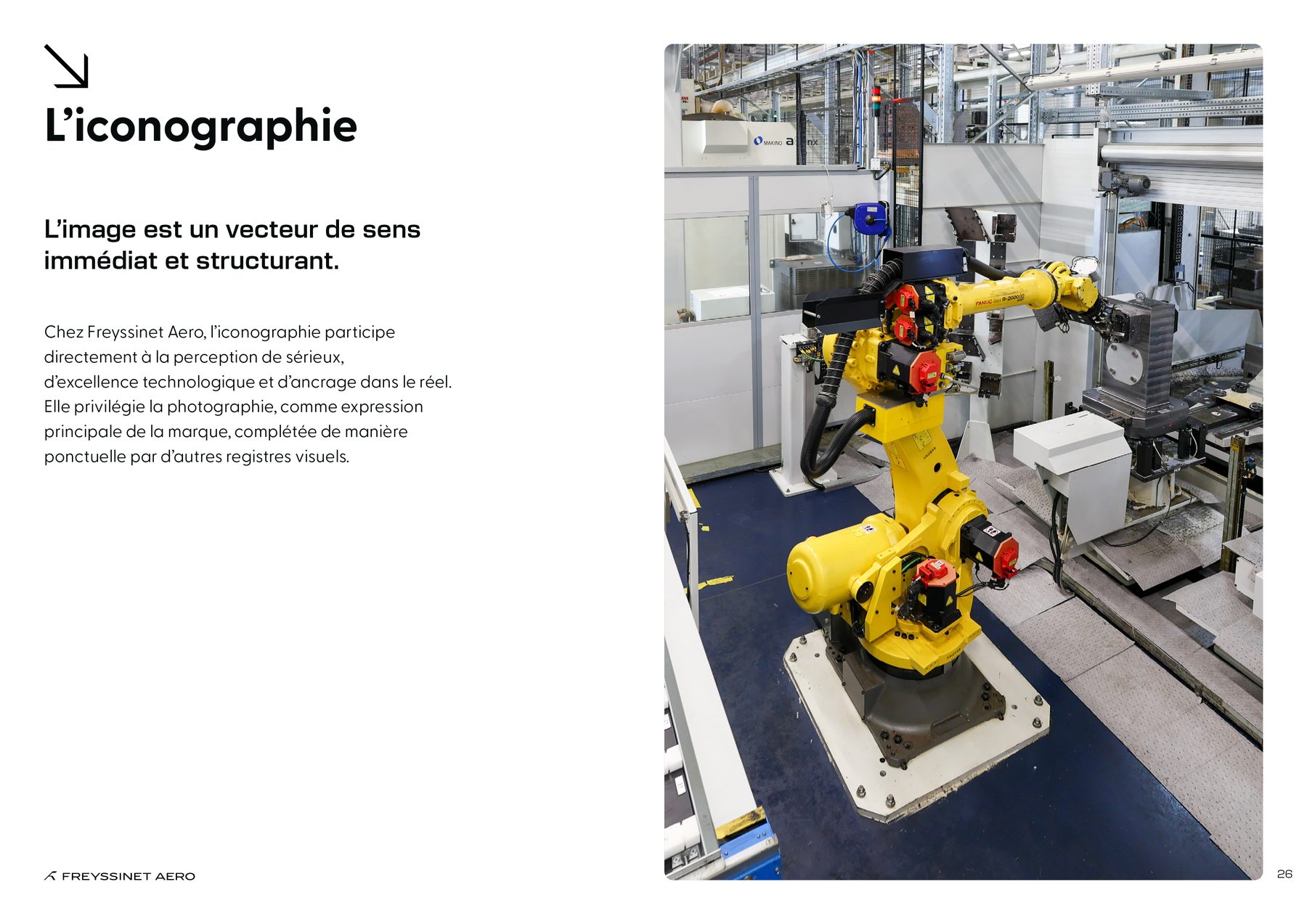
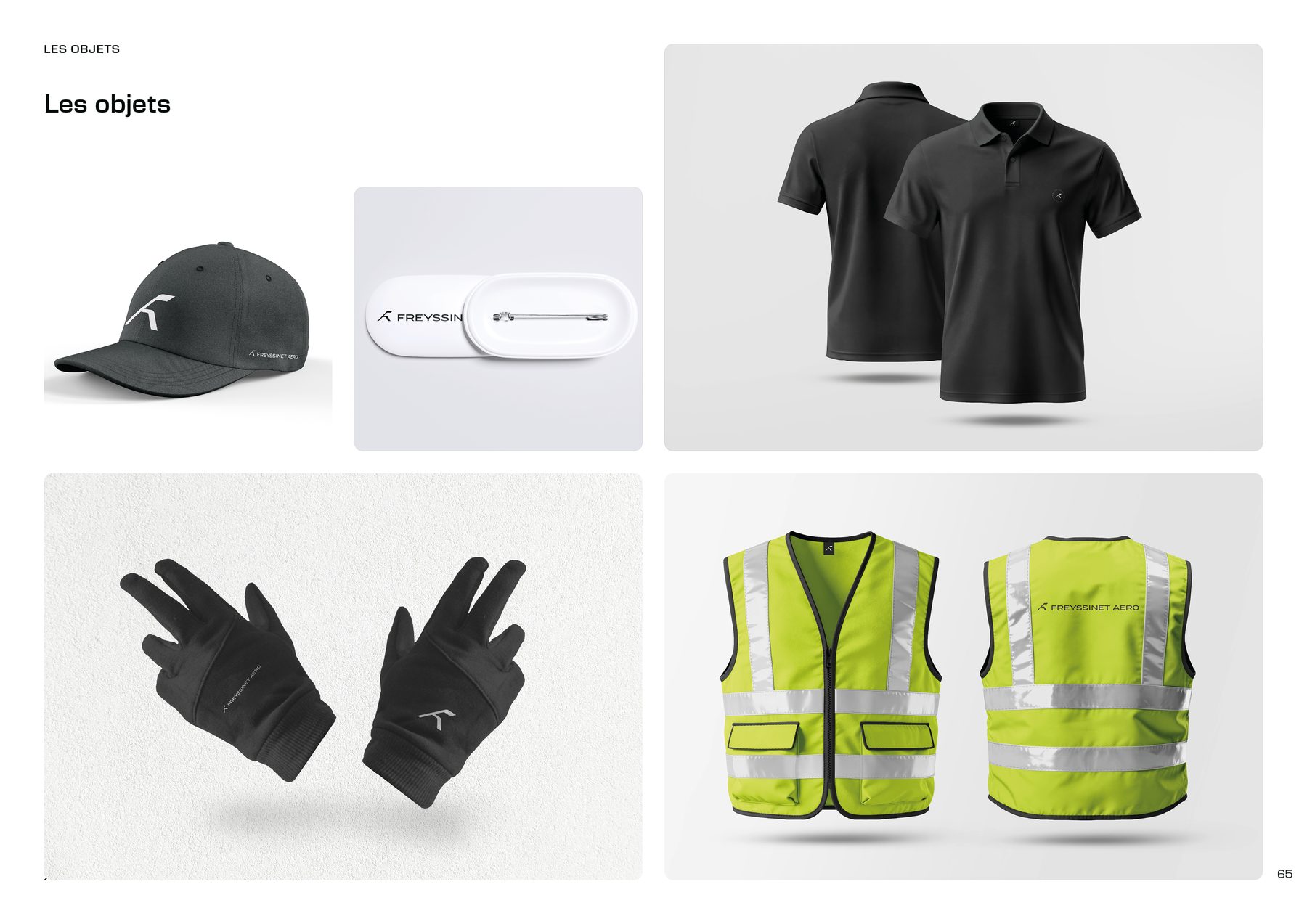
Excerpts from the brand guidelines, scroll horizontally on hover.
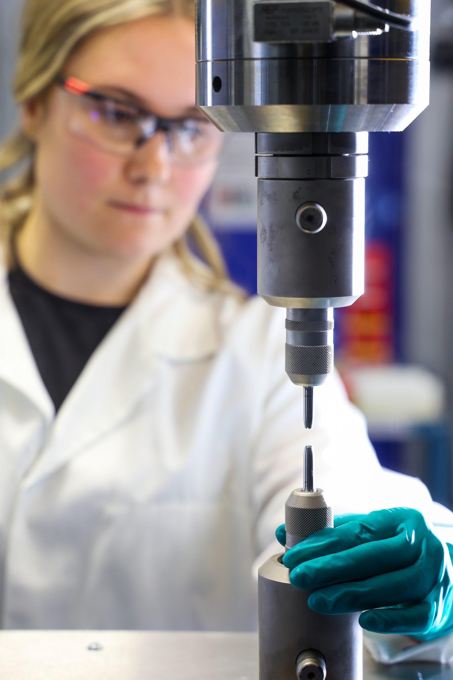
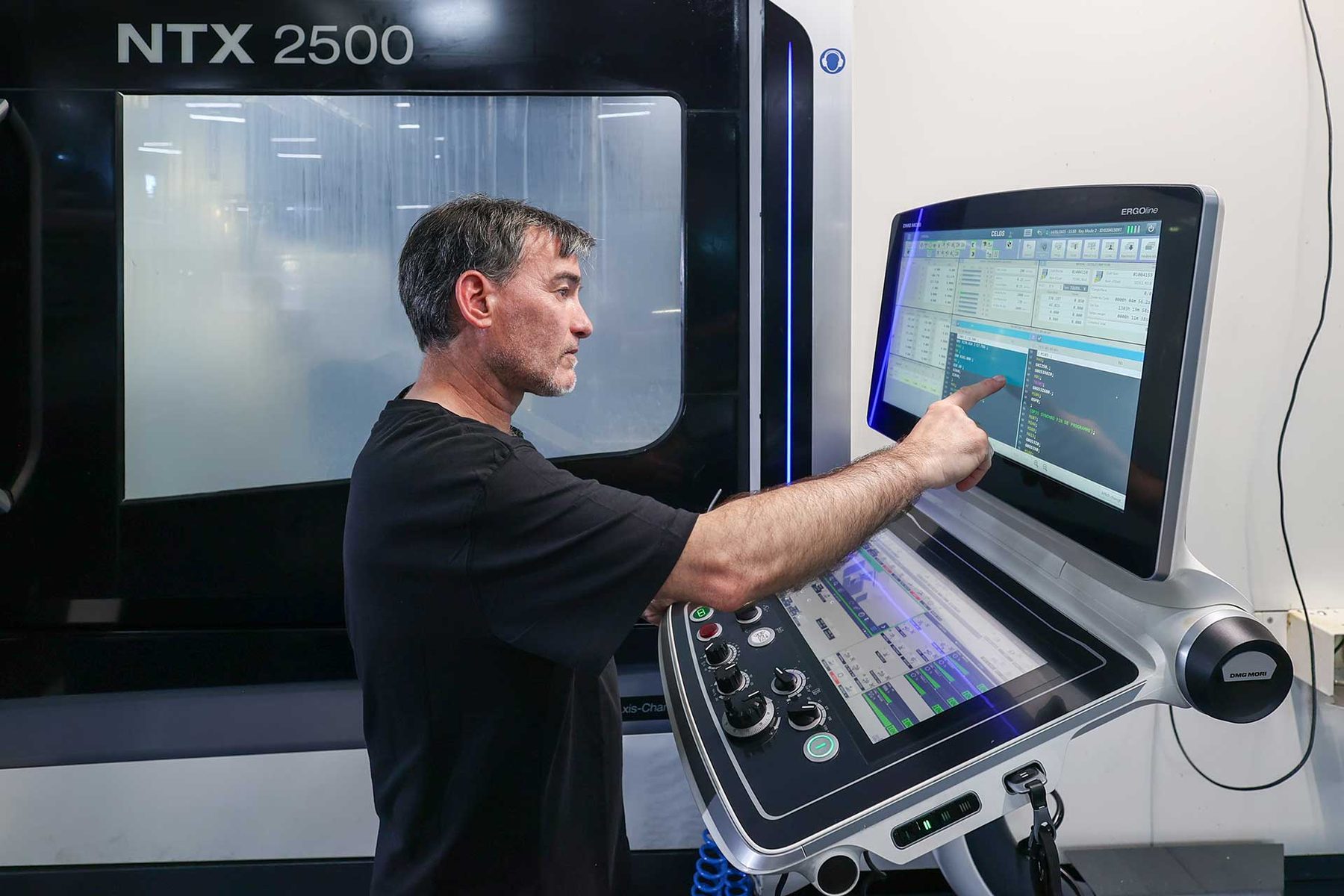
The website was first mocked up in Adobe XD, then handed to a freelance developer to meet the Le Bourget deadline. The result fell short and the collaboration was not workable. I took the entire website back over alone on WordPress and Elementor after the show. That is the version currently live. In parallel, direction of the corporate photo shoot with a partner photographer, across every site and trade.
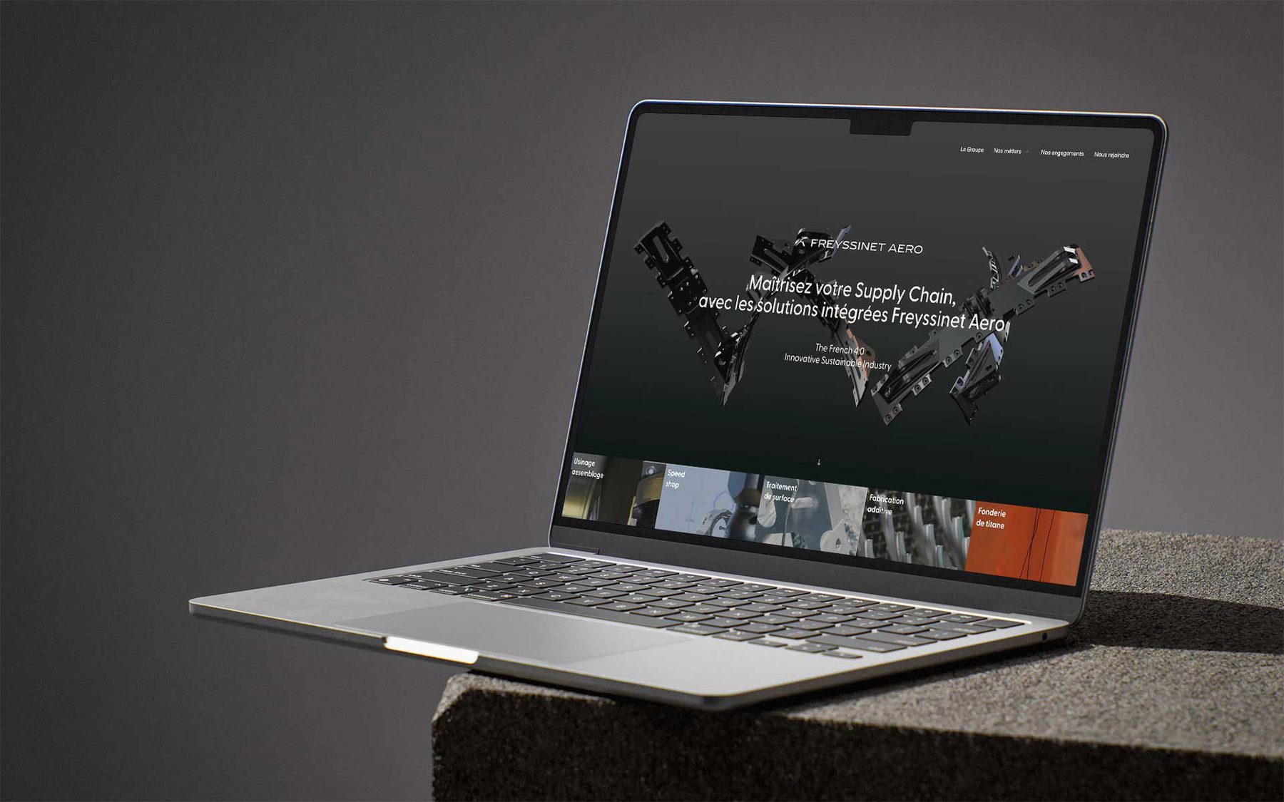
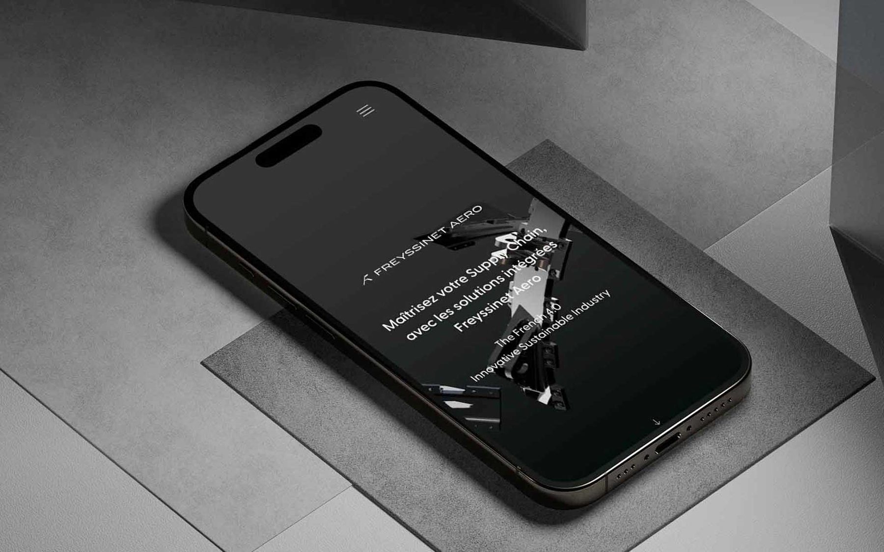
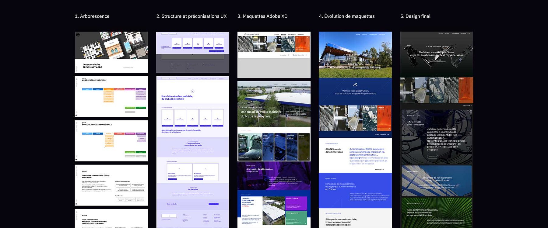
An inventory of the materials rolled out, the formalised documents handed to the leadership, and the workstreams identified for continuity into 2026.
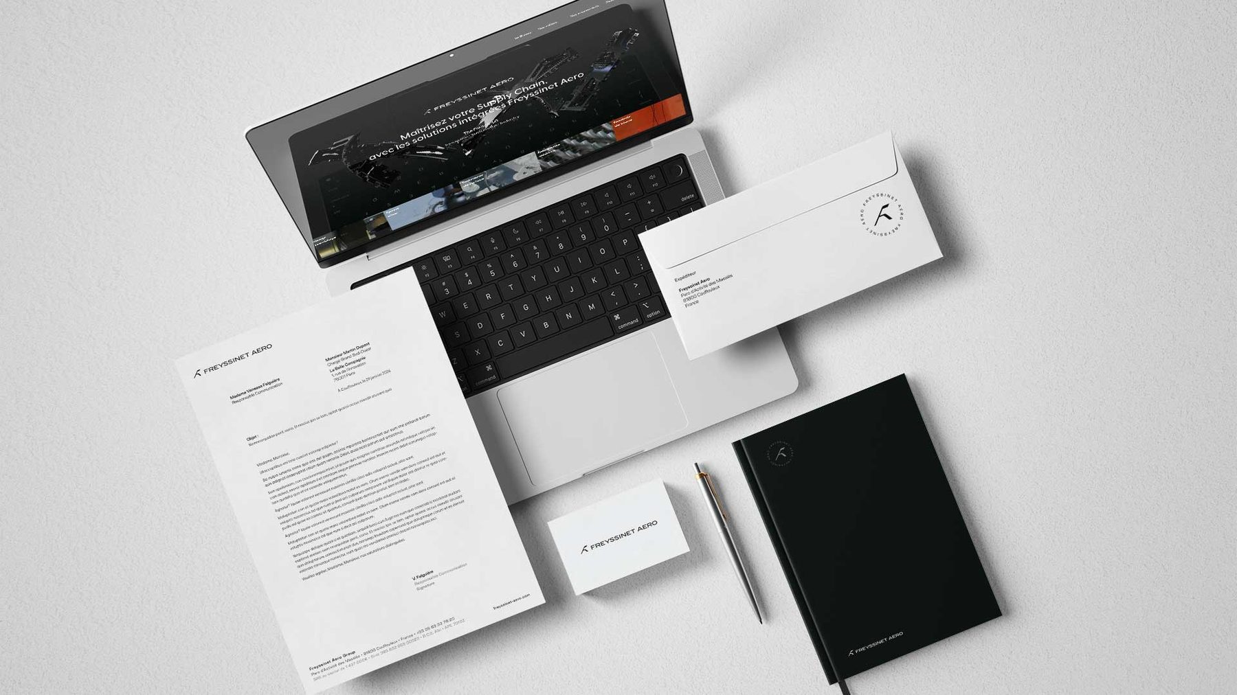
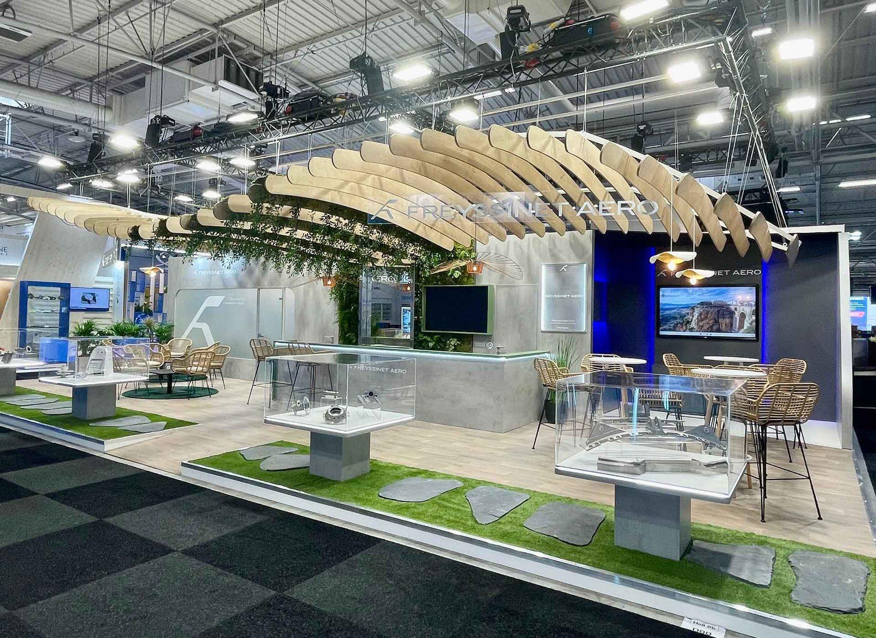
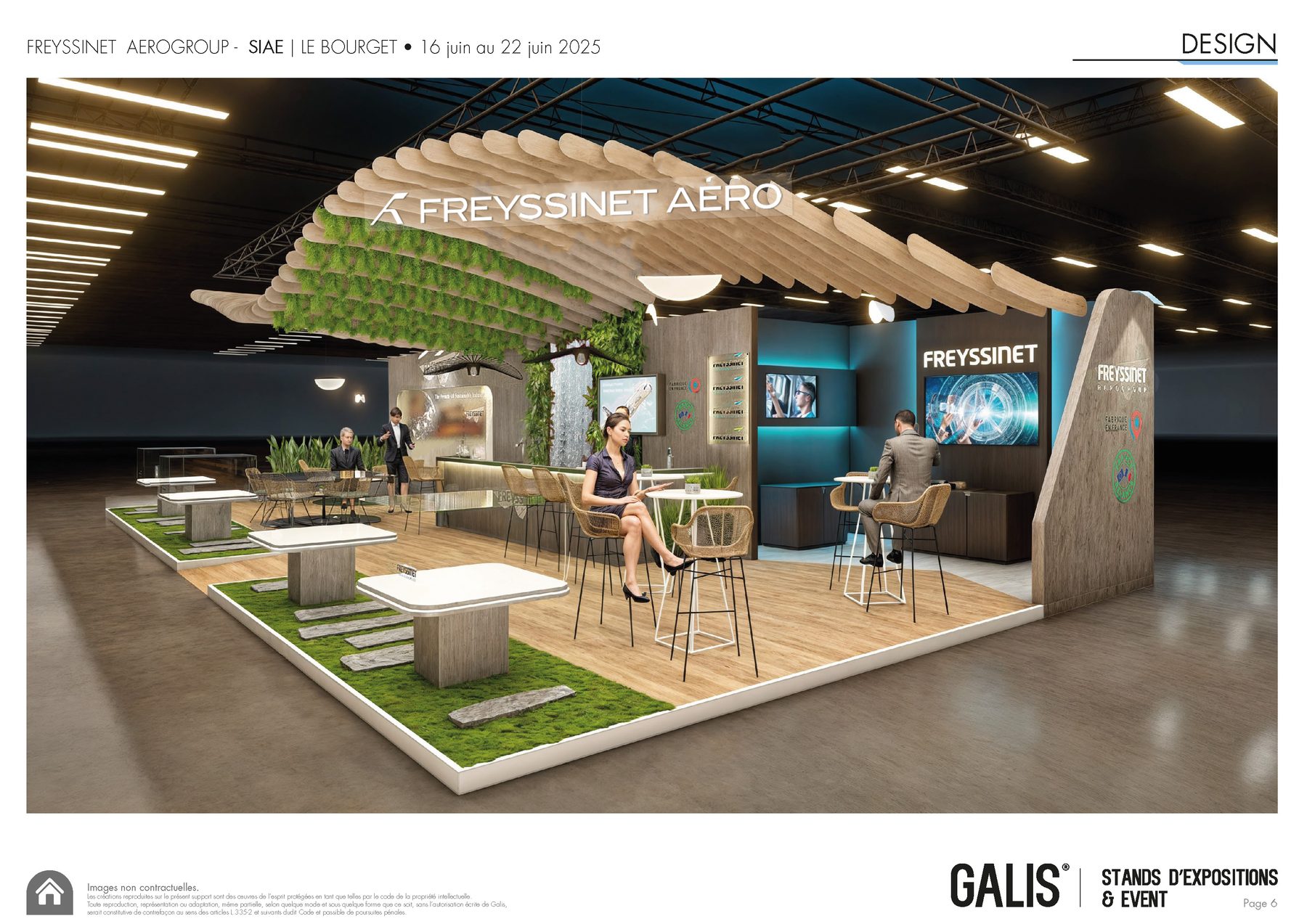
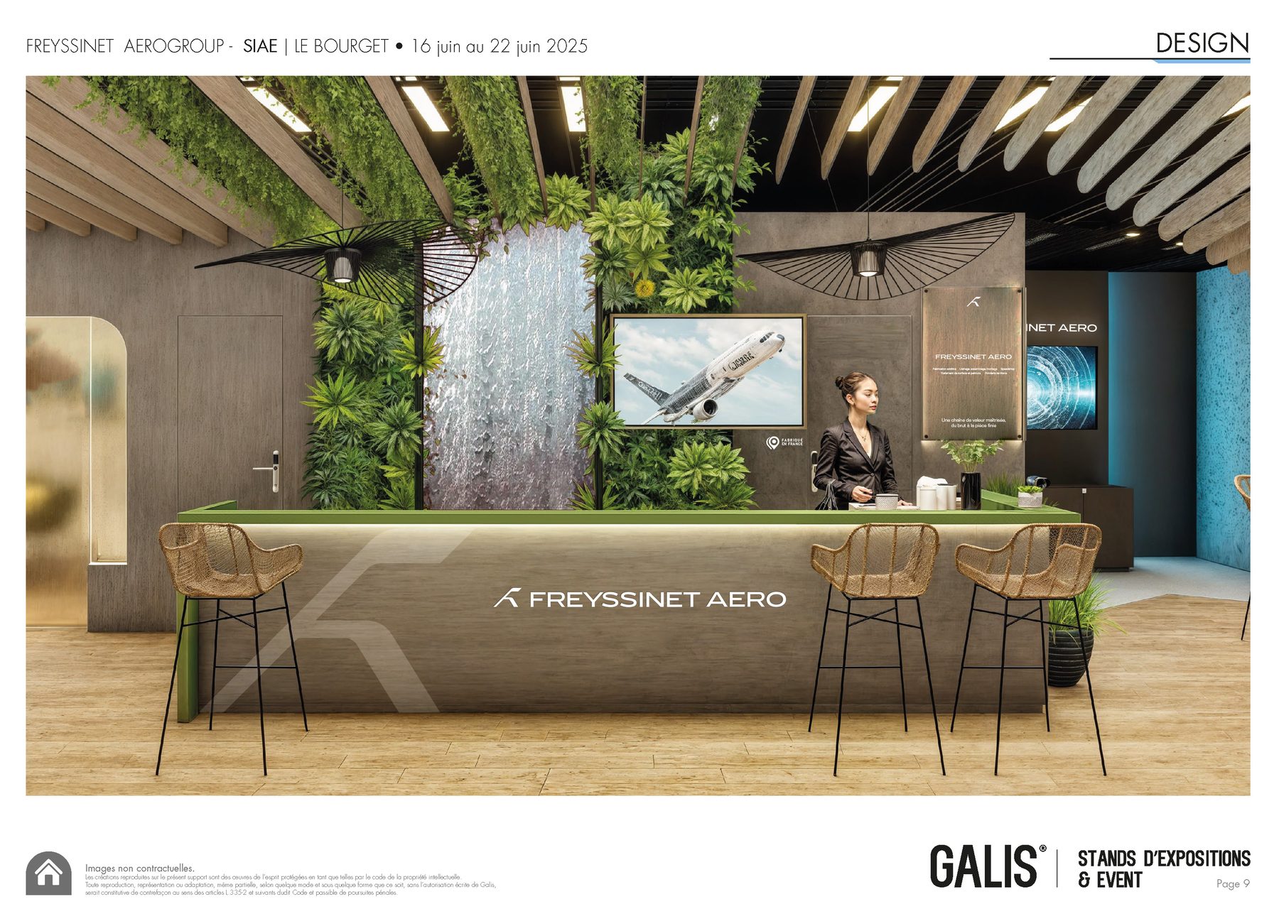
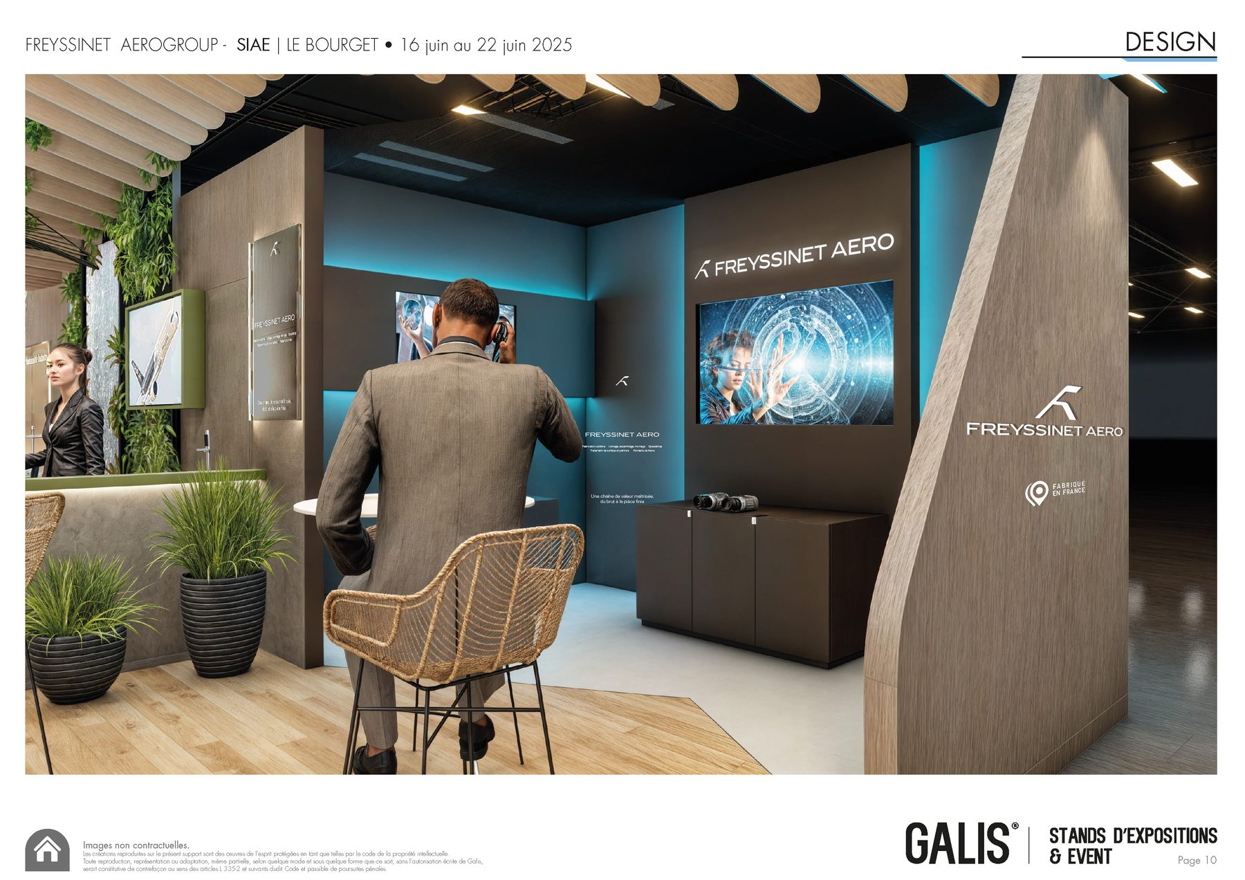
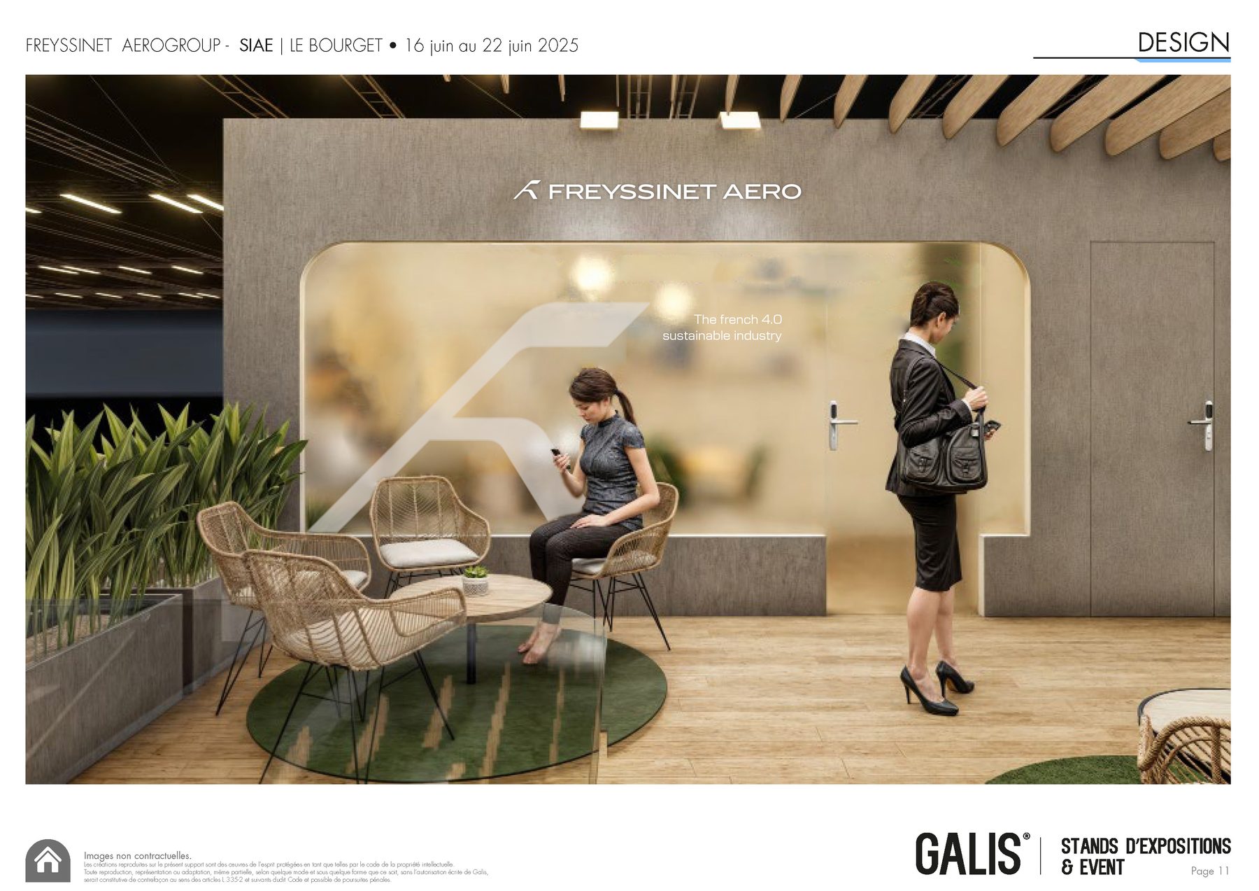
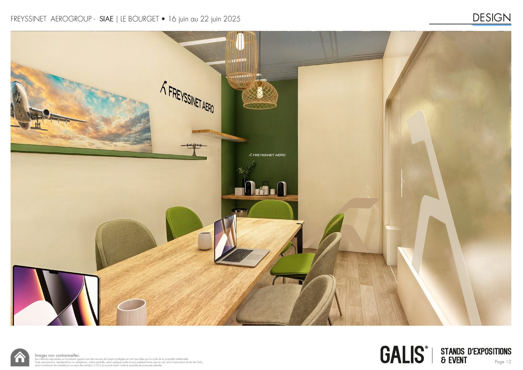
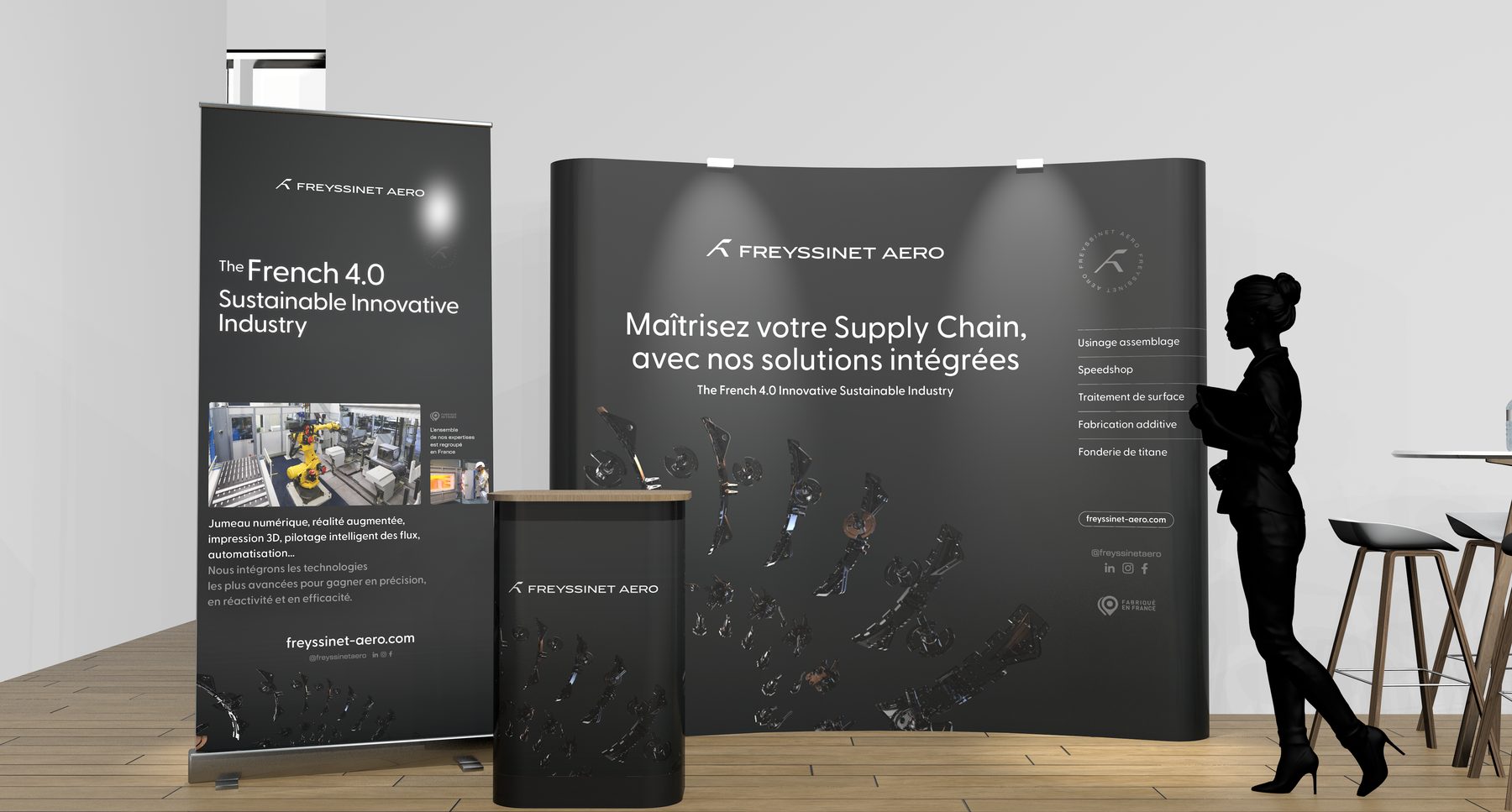
SIAE Paris Le Bourget booth design, scroll horizontally on hover.
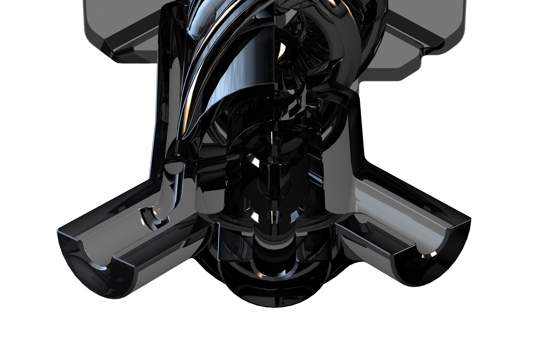
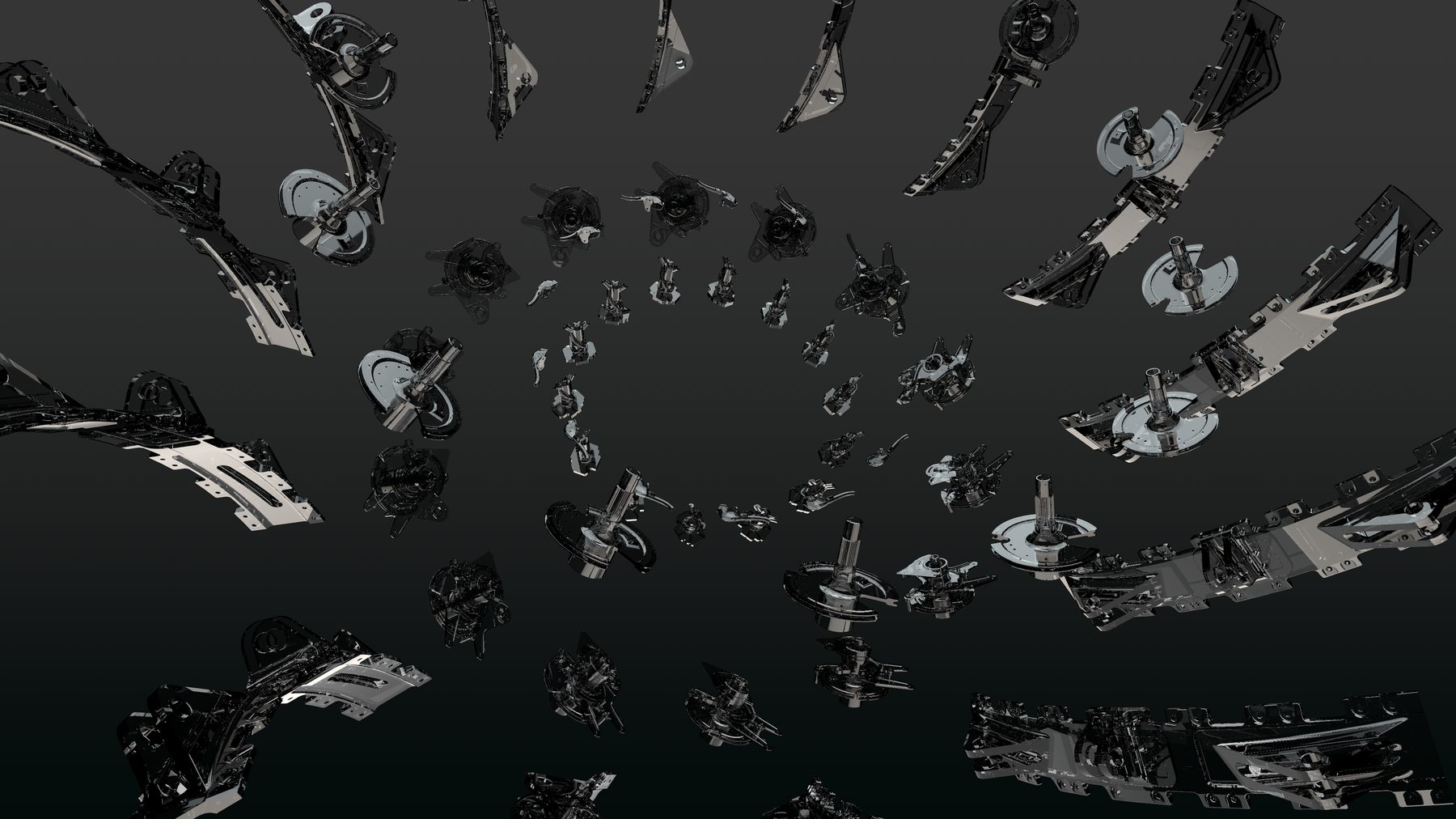
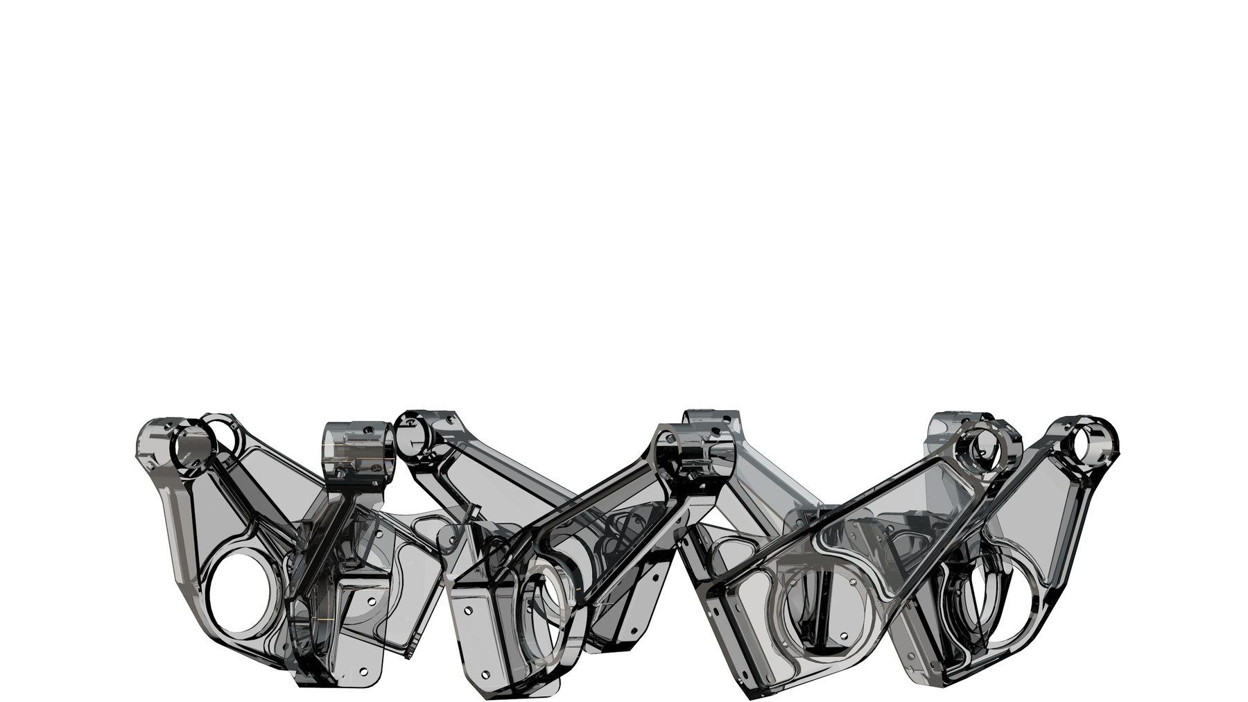
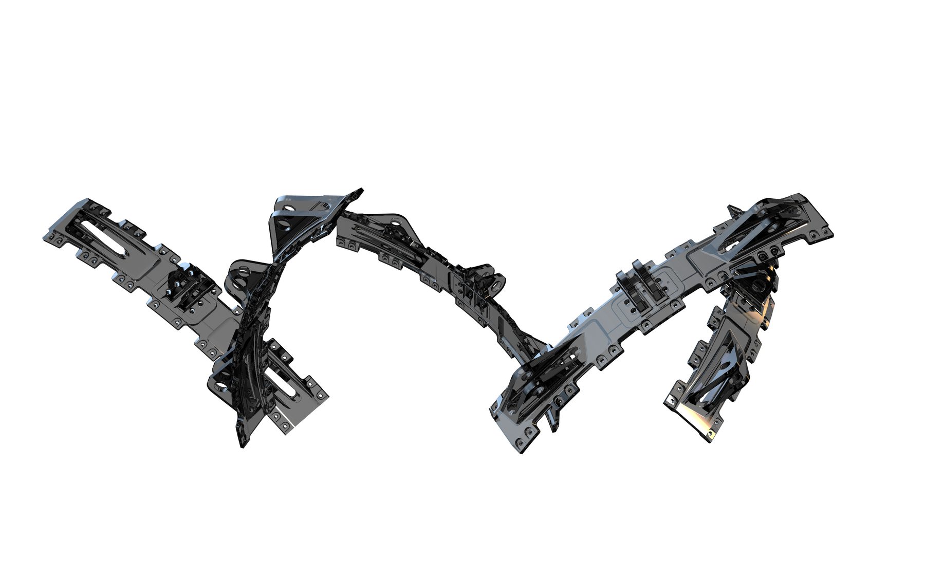
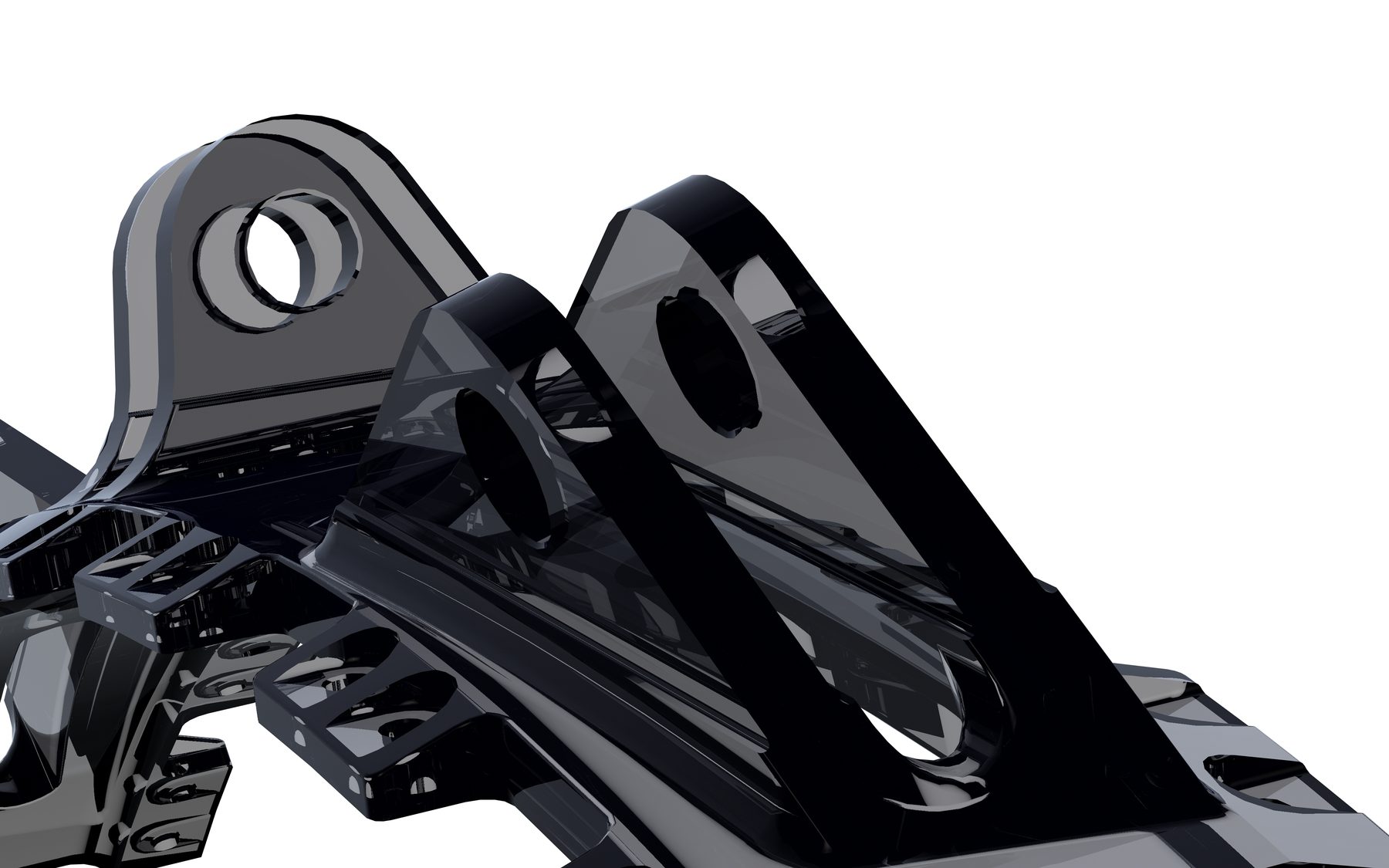
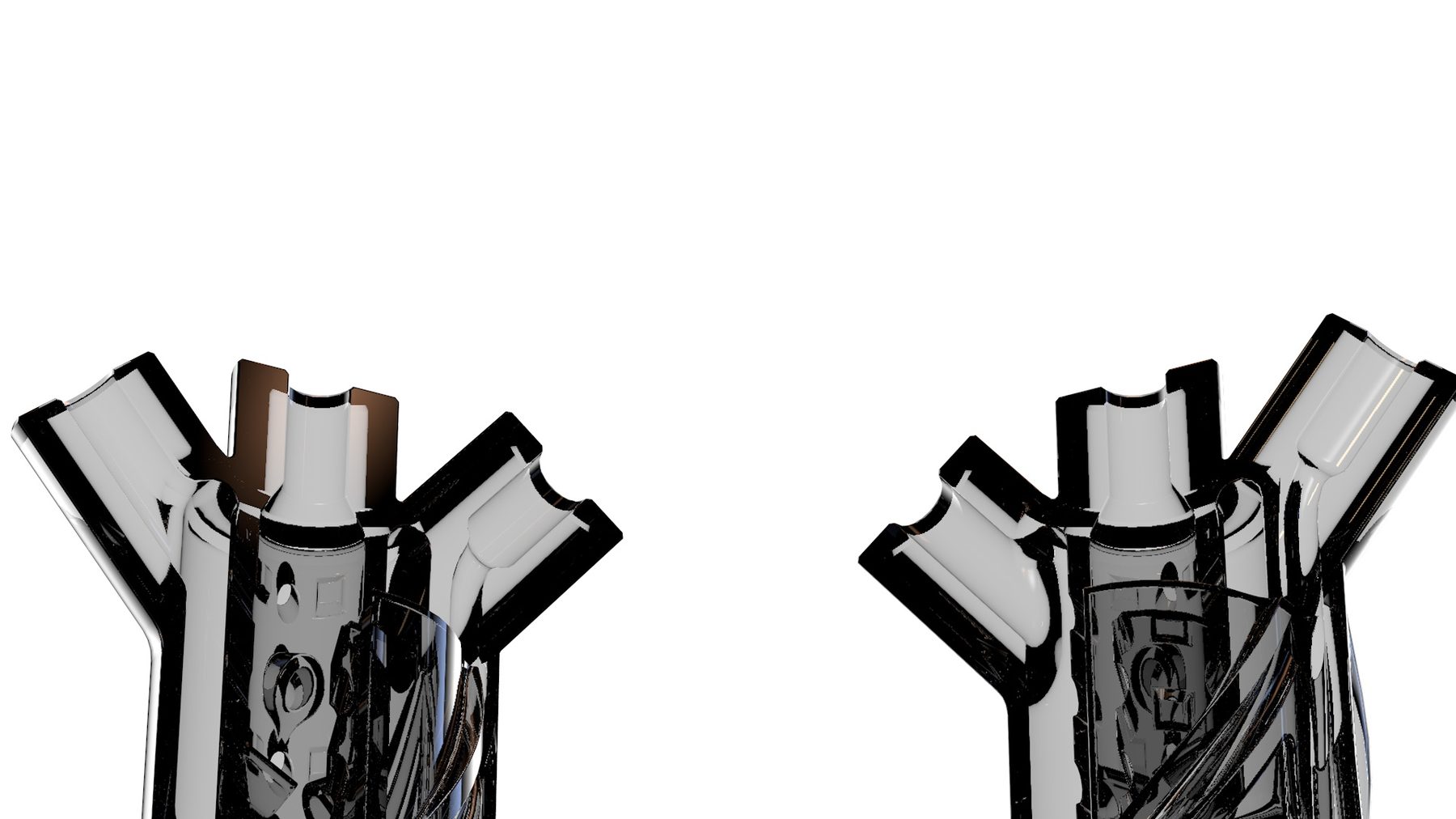
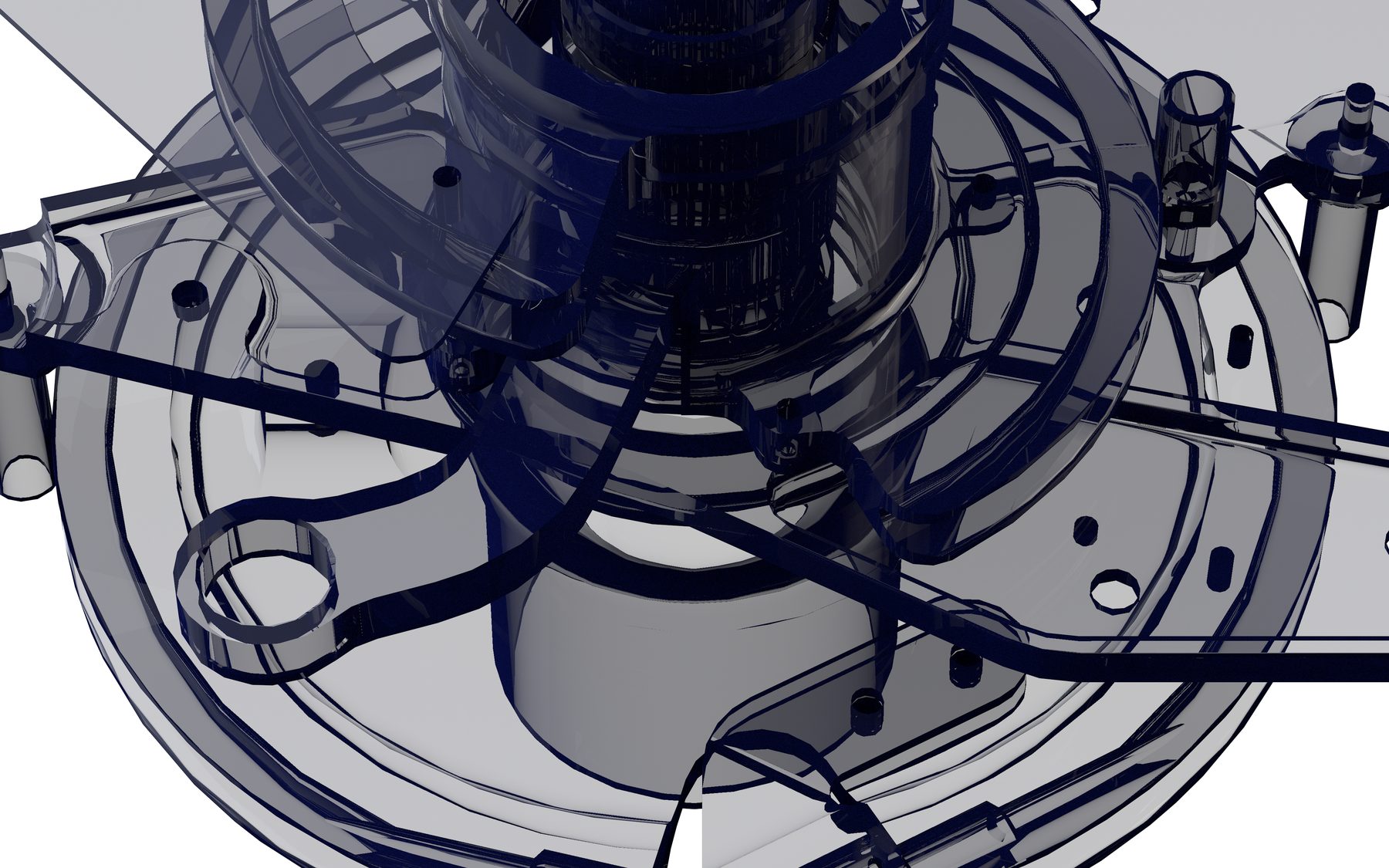
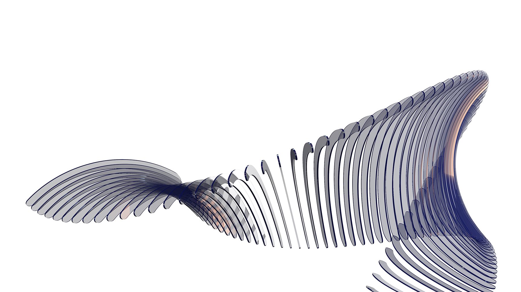
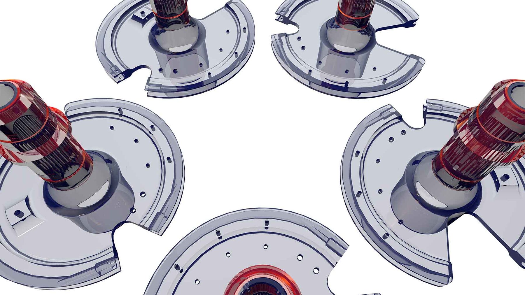
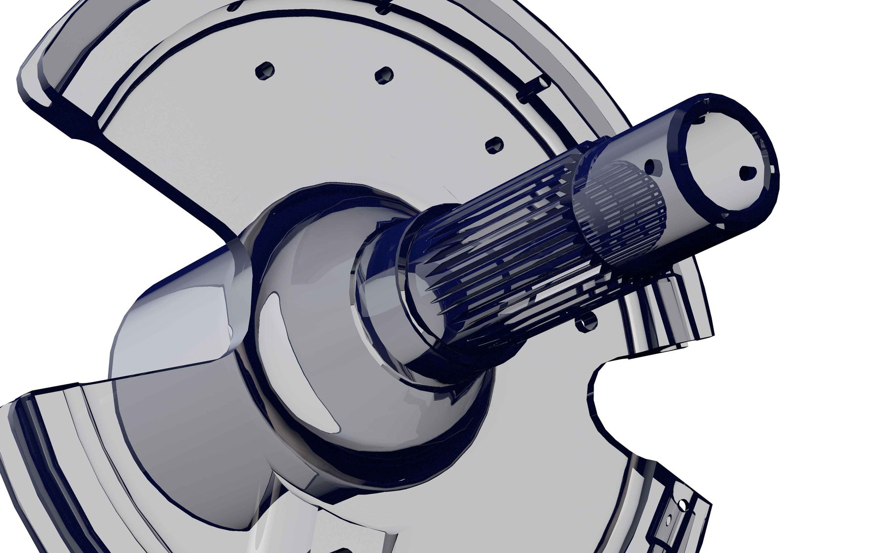
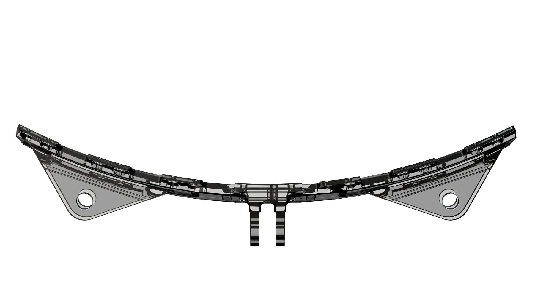
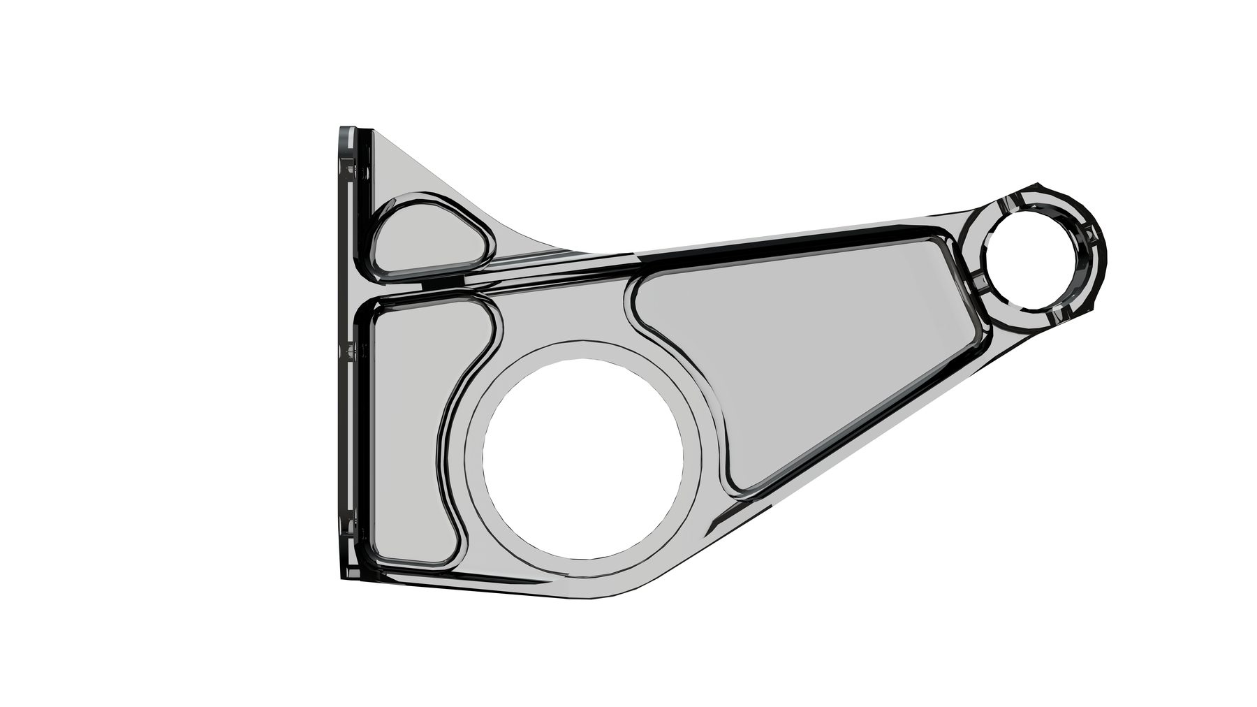
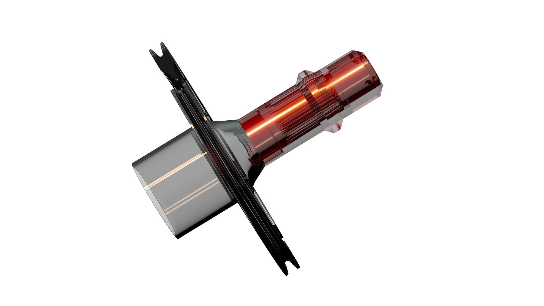
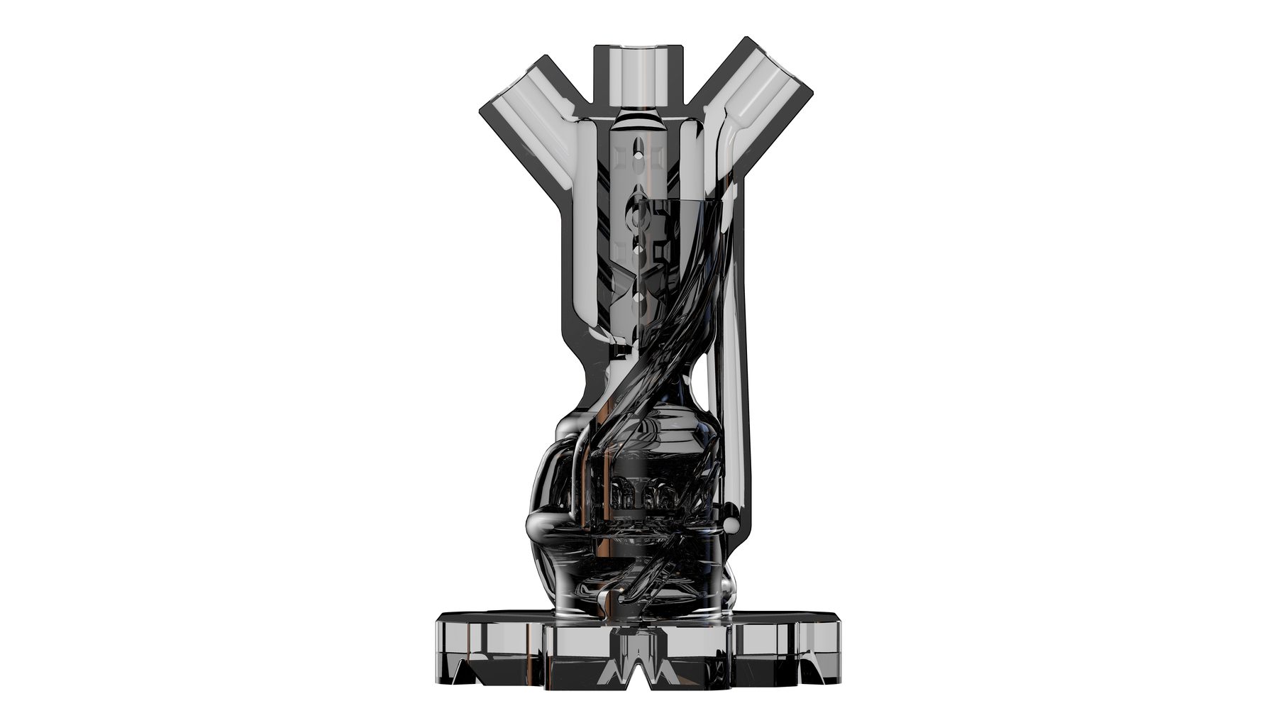
3D renders, staging the identity system, scroll horizontally on hover.
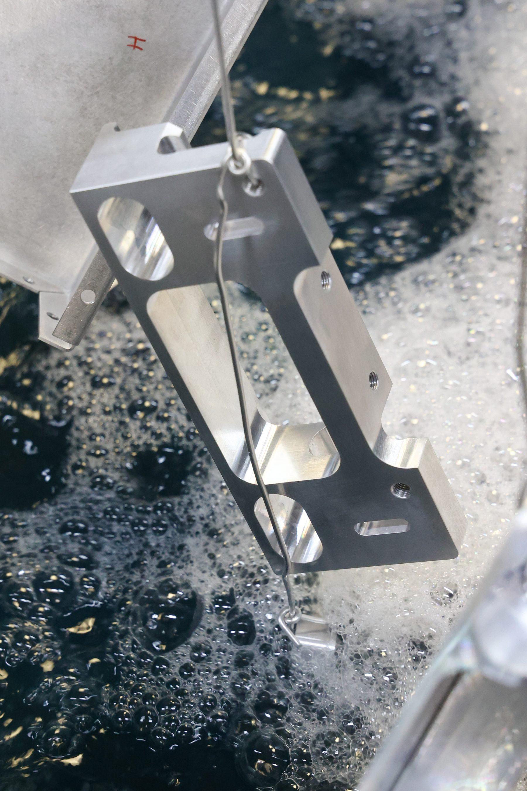
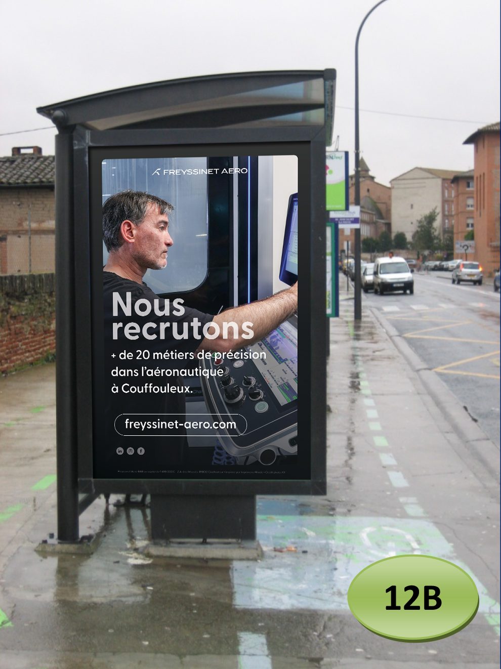
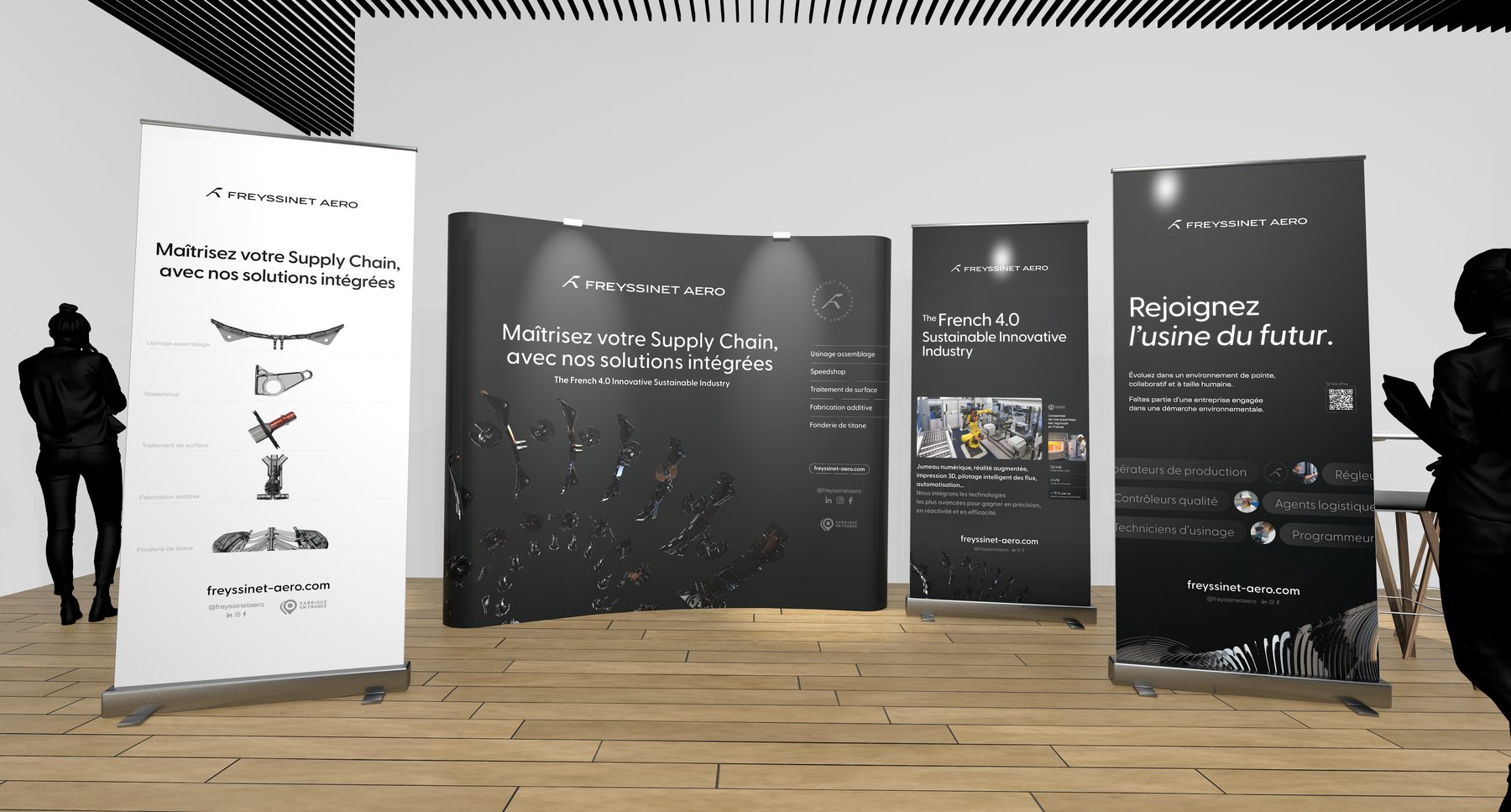
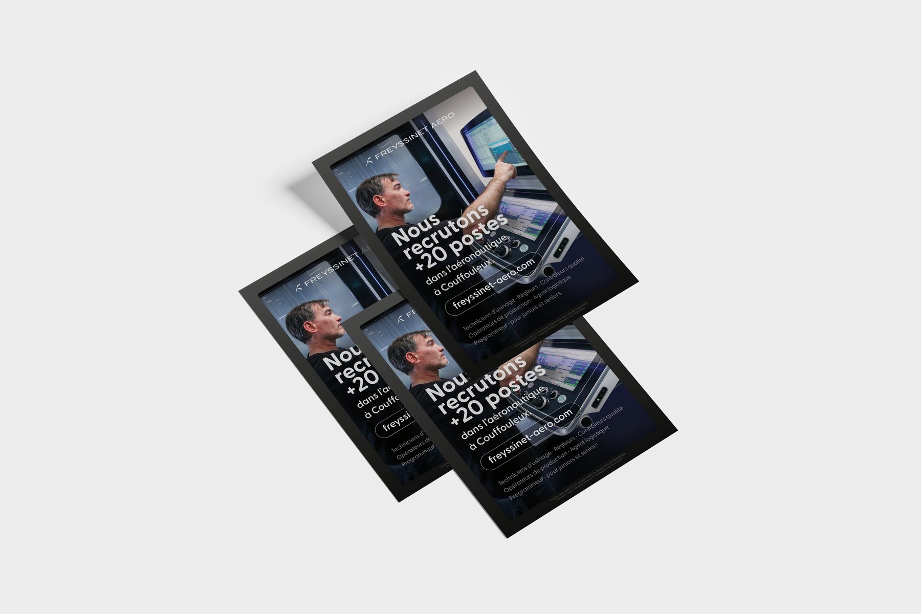
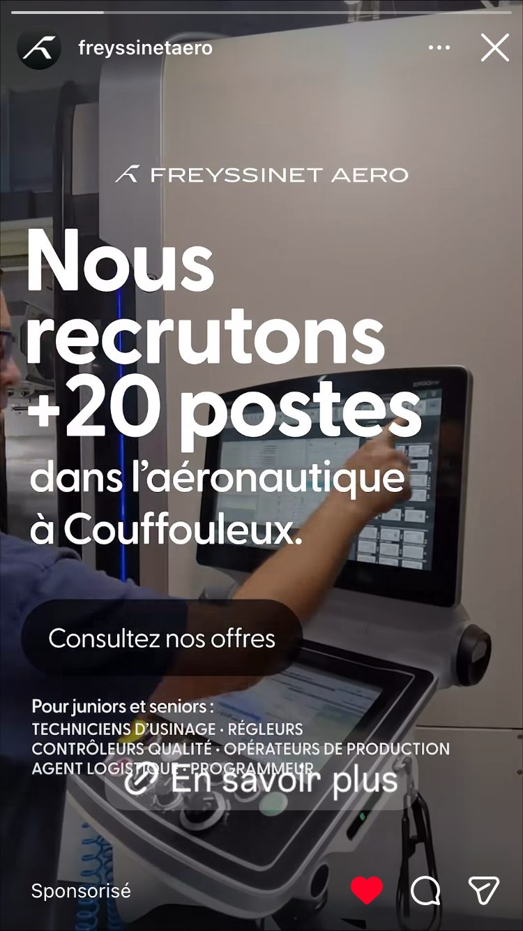
2026 continuation.
Ongoing relationship, several workstreams identified for 2026.
Single point of contact on the provider side for the whole duration of the mandate. Strategic consulting, art direction, graphic production, management of the development subcontracting, web production handled independently, photo direction.
The only other stakeholders: the initial freelance developer, whose collaboration was not continued after Le Bourget, and the photographer for the corporate photo shoot.